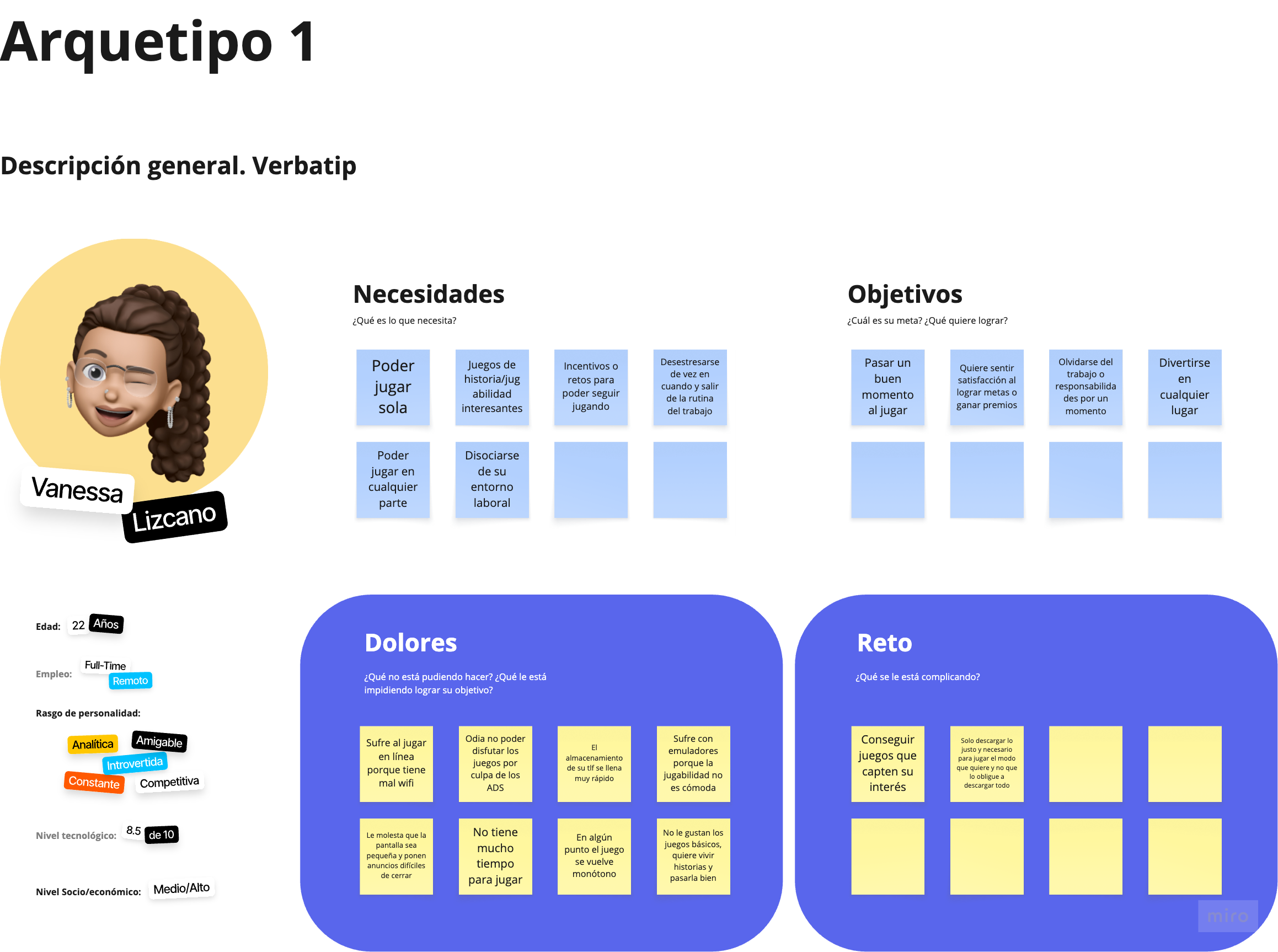
Vanessa
A worthwhile break. She needs interesting games she can enjoy independently, with little time lost to ads, downloads or setup. Connection and storage constraints can get in the way.
From five players’ stories to a gaming experience built around different ways to play.
Try the prototype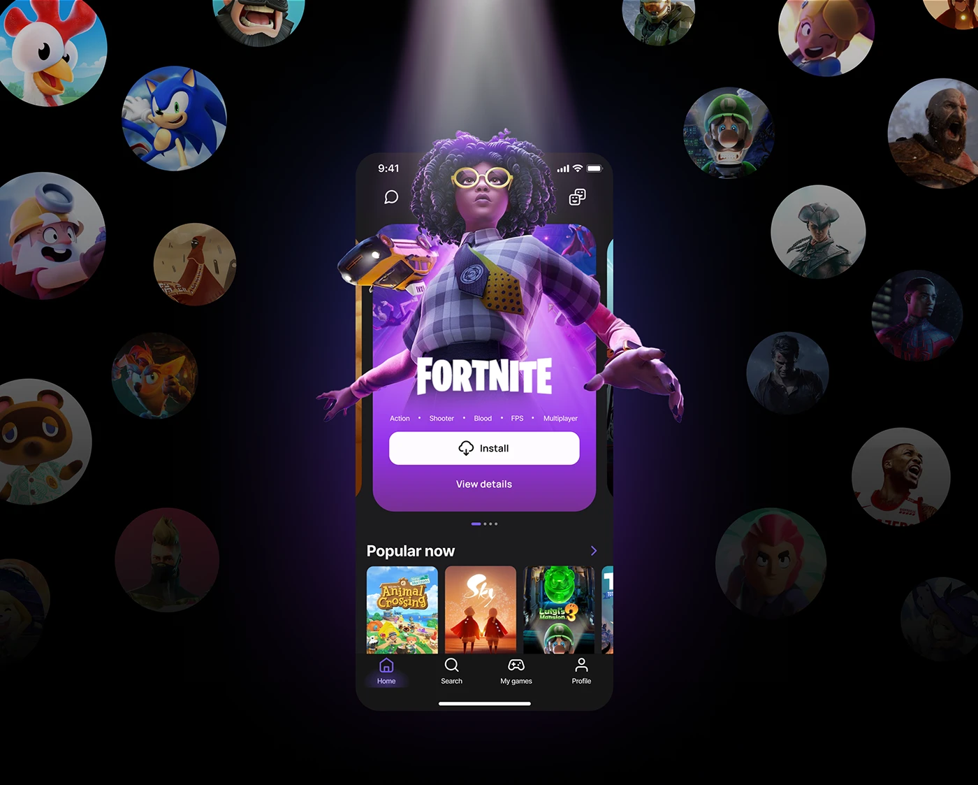
 Explore the full project canvasFollow the research, synthesis, prioritisation and iterations in the original Miro board.
Hubble is a mobile gaming concept developed for the UX/UI MicroDegree, Cohort 2, in collaboration with UTEC. It received first place as Best Project. The work connects research, prioritisation, information architecture, prototype testing and a reusable visual system.
My role was User Researcher / Product Designer. This case follows the team’s documented work and the decisions it raised: how to support someone who wants a quiet break as well as someone who wants to compete with friends.
What makes a game worth picking up on your phone?
The outcome is an award-winning design project, not a claim of a launched gaming service. Offline play, cloud saves and cross-device access describe the concept; the prototype explores how people would discover and use it.
Hubble began with a familiar frustration: I wanted more satisfying games on my phone. That was a reason to investigate. We asked when people chose mobile over another device, what interrupted a good session, and whether they wanted to play alone, with friends, online or offline.
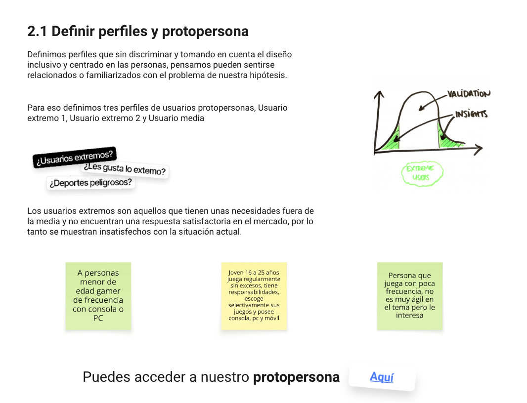
We outlined three initial recruitment profiles, including more and less experienced players, then recruited five people through our existing networks. Their habits covered mobile, PC and console gaming. This was exploratory research with a small convenience sample.
Understand devices, playing moments, motivations and interruptions.
Include competitive play, casual sessions, social connection and solo time.
The blueprint’s anecdotes were starting points to investigate, not proof of market demand.
We prepared an interview pitch, topics and questions around our assumptions. The project canvas also asks us to examine cultural biases and people the design might exclude. That reflection does not establish that every identified group participated in the study.
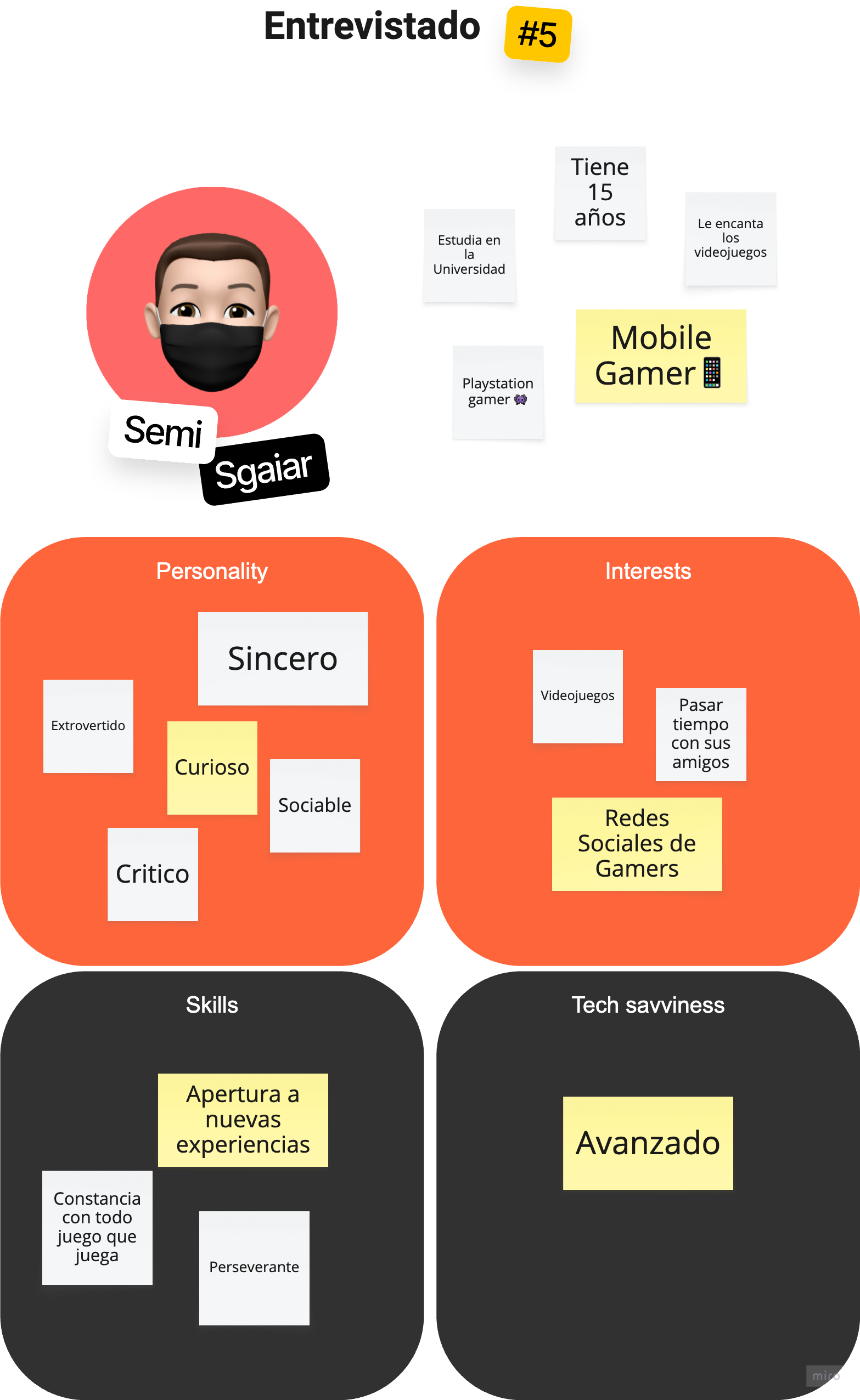
The five documented participants brought competitive PC/console play, retro gaming and mobile habits. Their profiles informed the synthesis; they were not five finished personas.
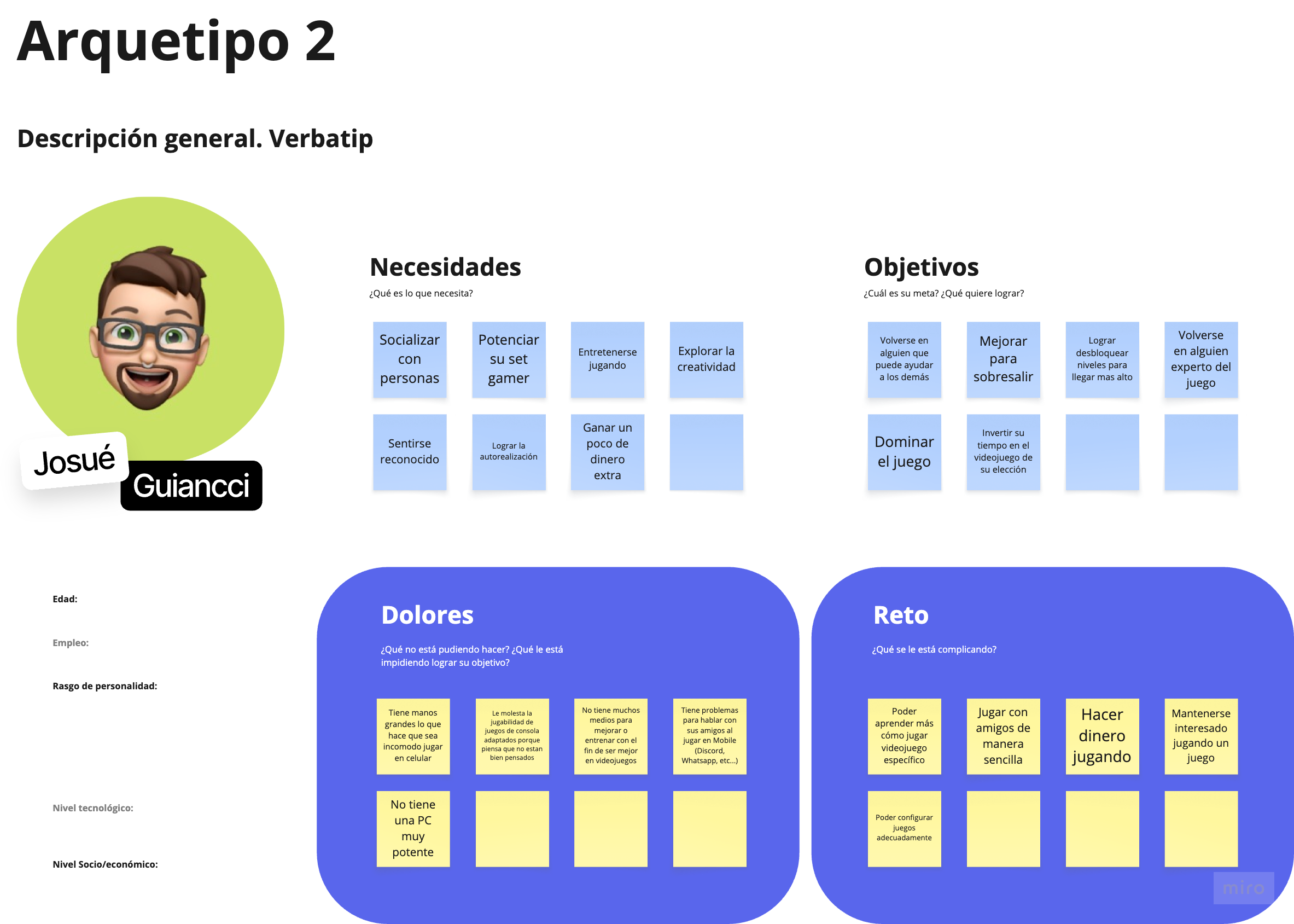
Original proto-persona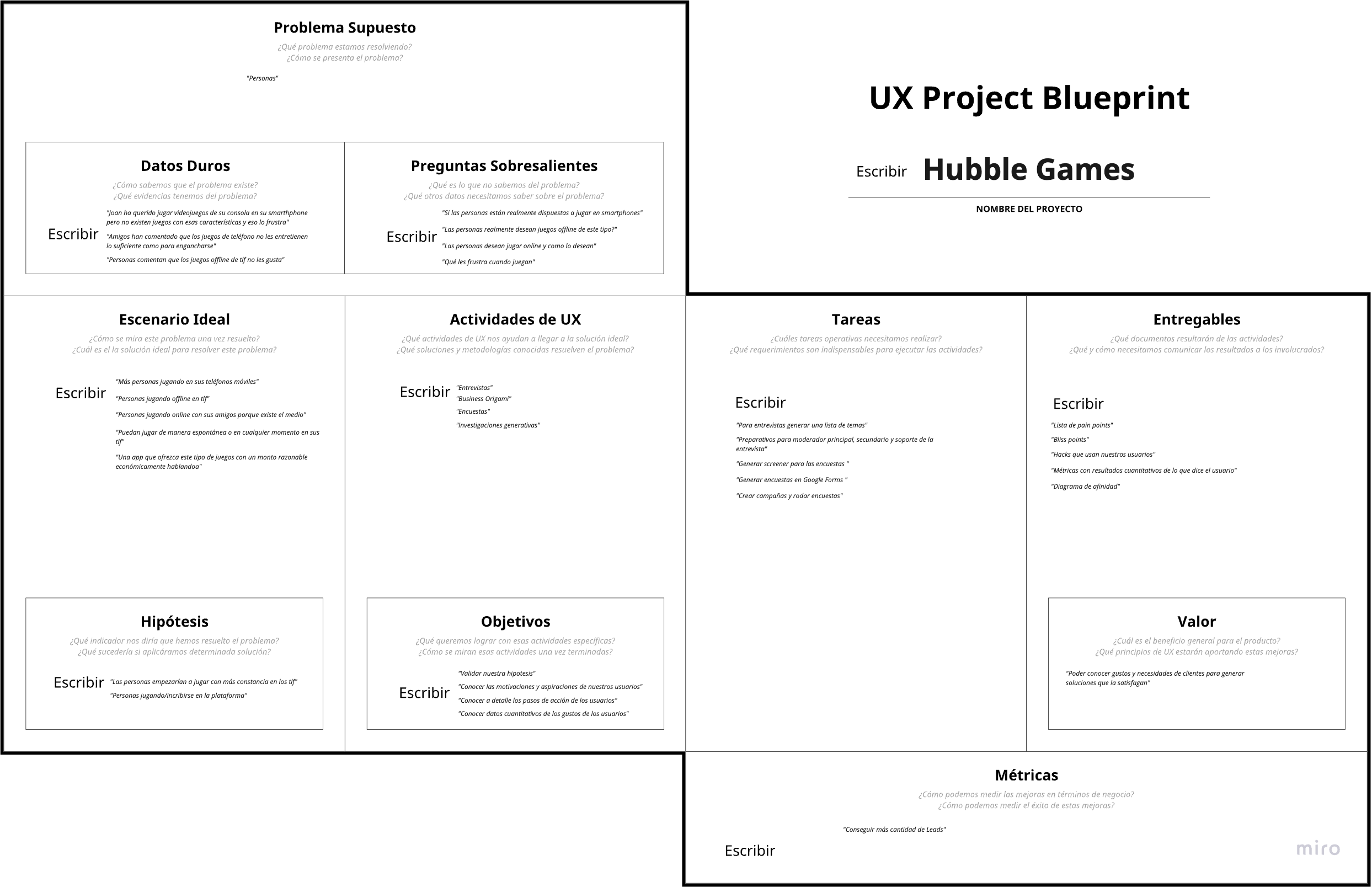
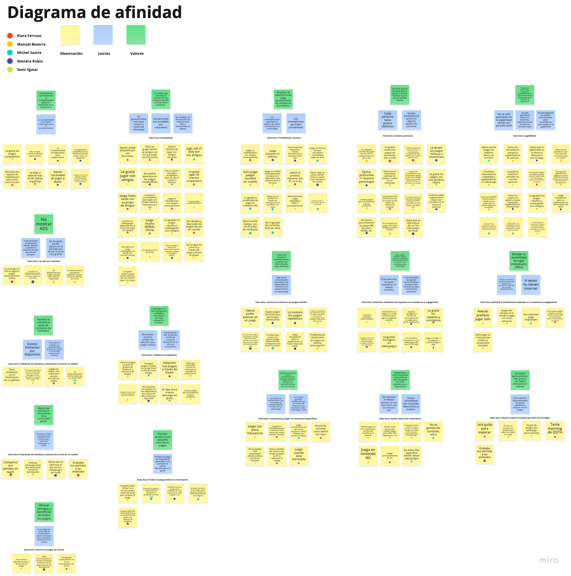
We grouped the interviews into an affinity map, keeping observations, interpretations and possible responses distinct. Ads, unstable connections, storage and awkward controls could interrupt a session. Friends and trusted stores shaped discovery. Competition mattered to some players; independent play mattered to others.
Make room for short sessions, solo play and unreliable connectivity.
Help people find interesting games without repeated downloads, irrelevant choices or intrusive interruptions.
Playing together, comparing progress and learning from others were meaningful needs, but not universal ones.
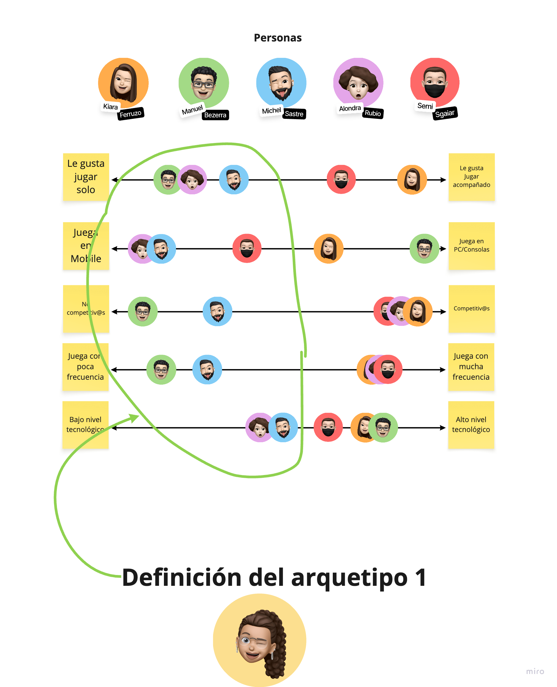
A worthwhile break. She needs interesting games she can enjoy independently, with little time lost to ads, downloads or setup. Connection and storage constraints can get in the way.
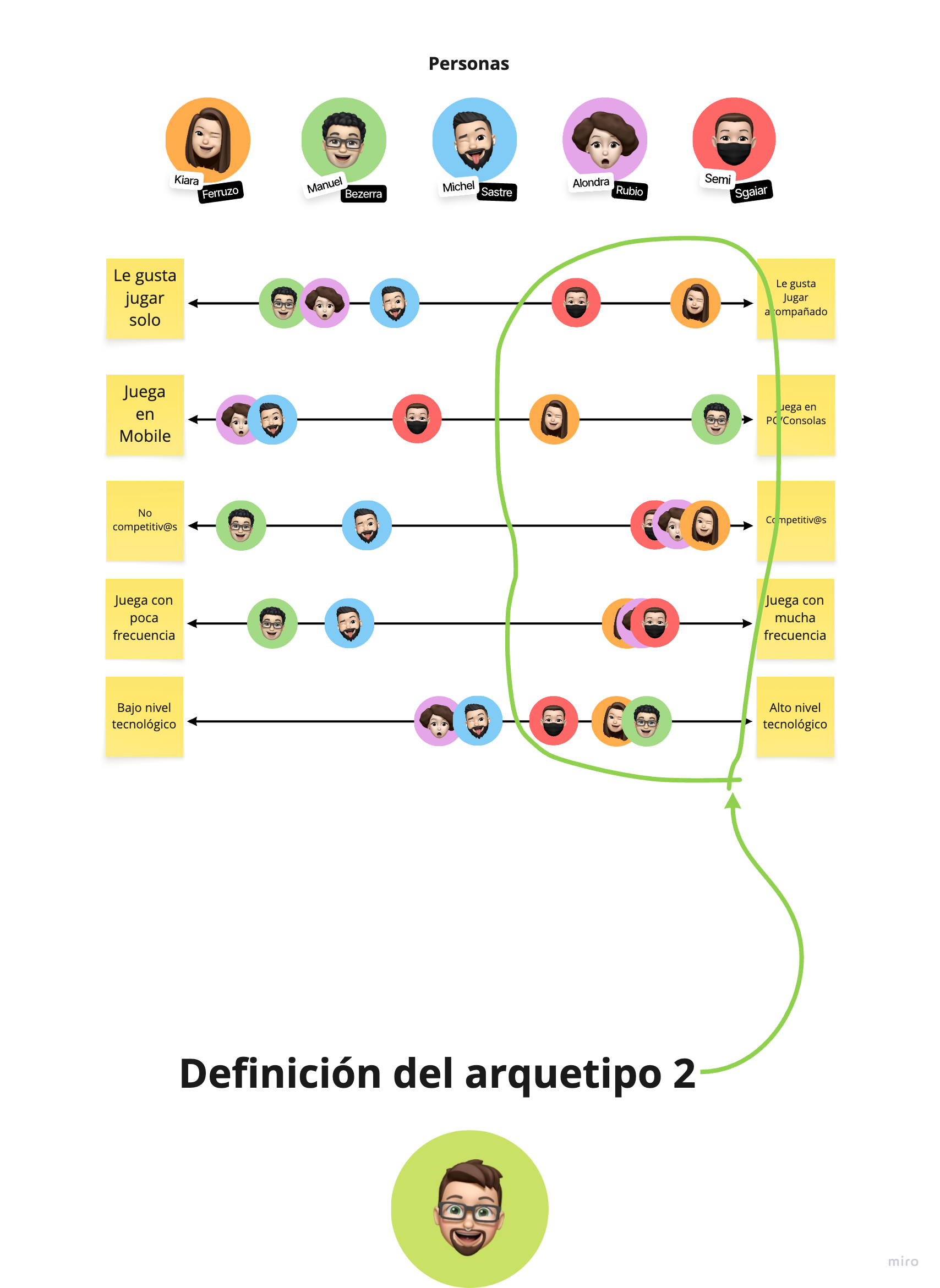
Progress with other people. He wants to learn, improve and feel recognised, while staying connected to friends. Fragmented communication and awkward controls make that harder.
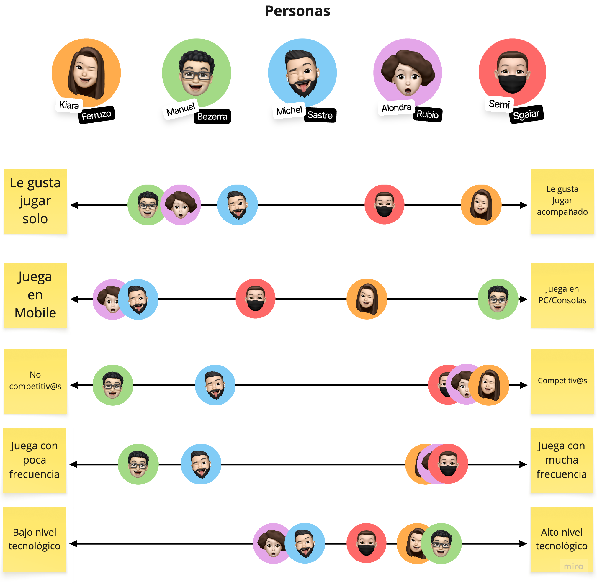
We compared the five participants across solo/social preference, device choice, competitiveness, frequency and technical familiarity. Vanessa and Josué are research-informed archetypes synthesised from those patterns, not additional interviewees.
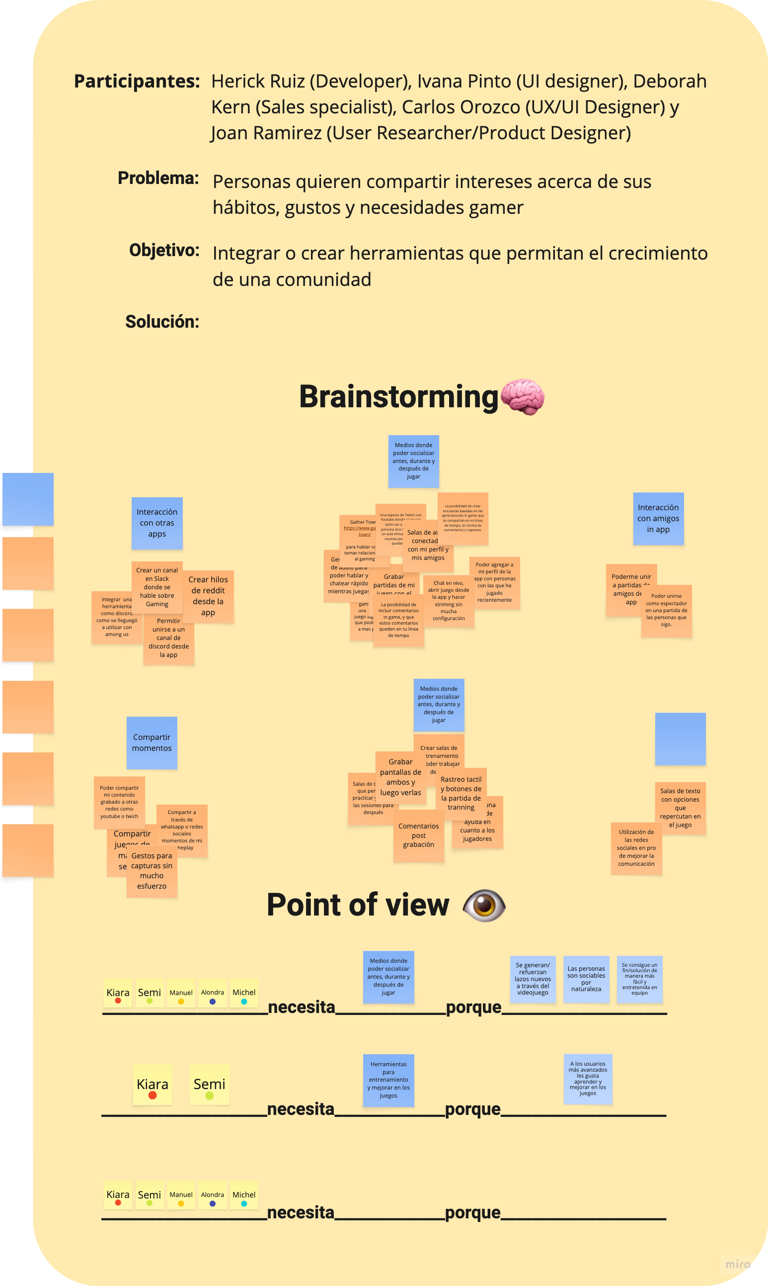
A cross-functional workshop explored communication before, during and after play, connections to existing apps, joining or watching friends, recording shared moments and practice rooms. The workshop included Herick Ruiz, Ivana Pinto, Deborah Kern, Carlos Orozco and me.
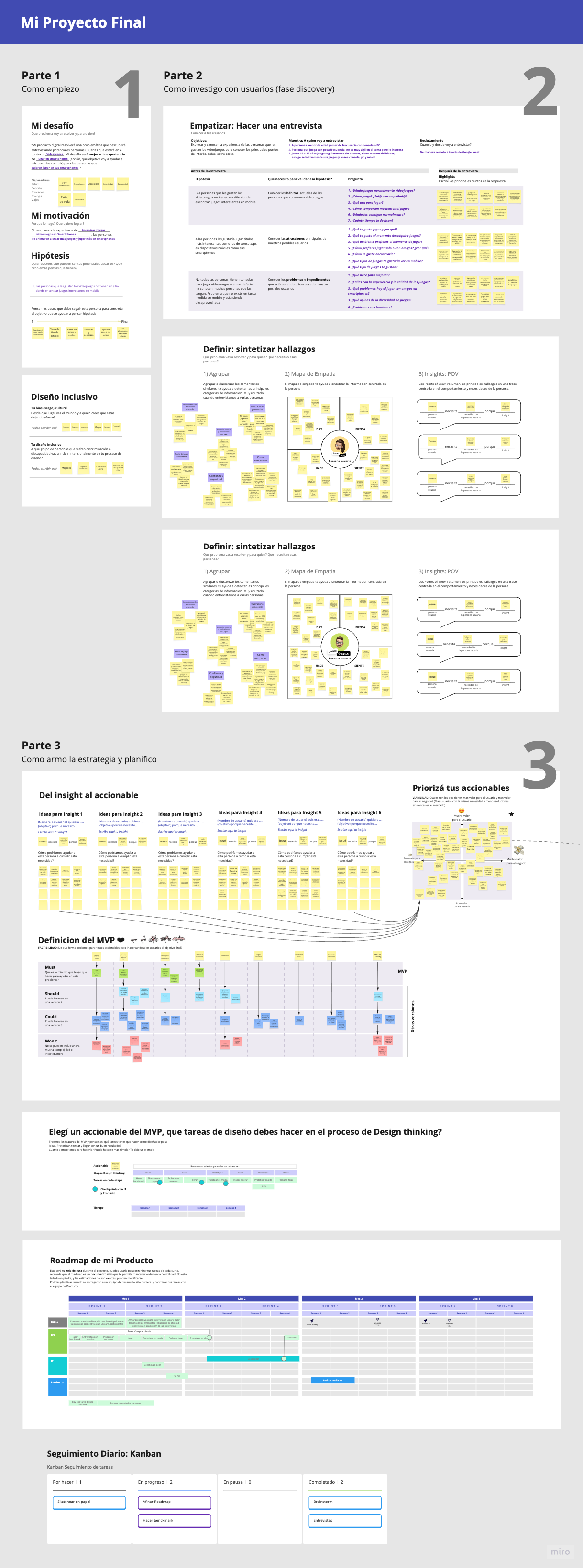
The canvas records value-based prioritisation, Must / Should / Could / Won’t scope, a roadmap and Kanban. These preserve the planning work; candidate ideas and planned releases are not evidence of shipped functionality.
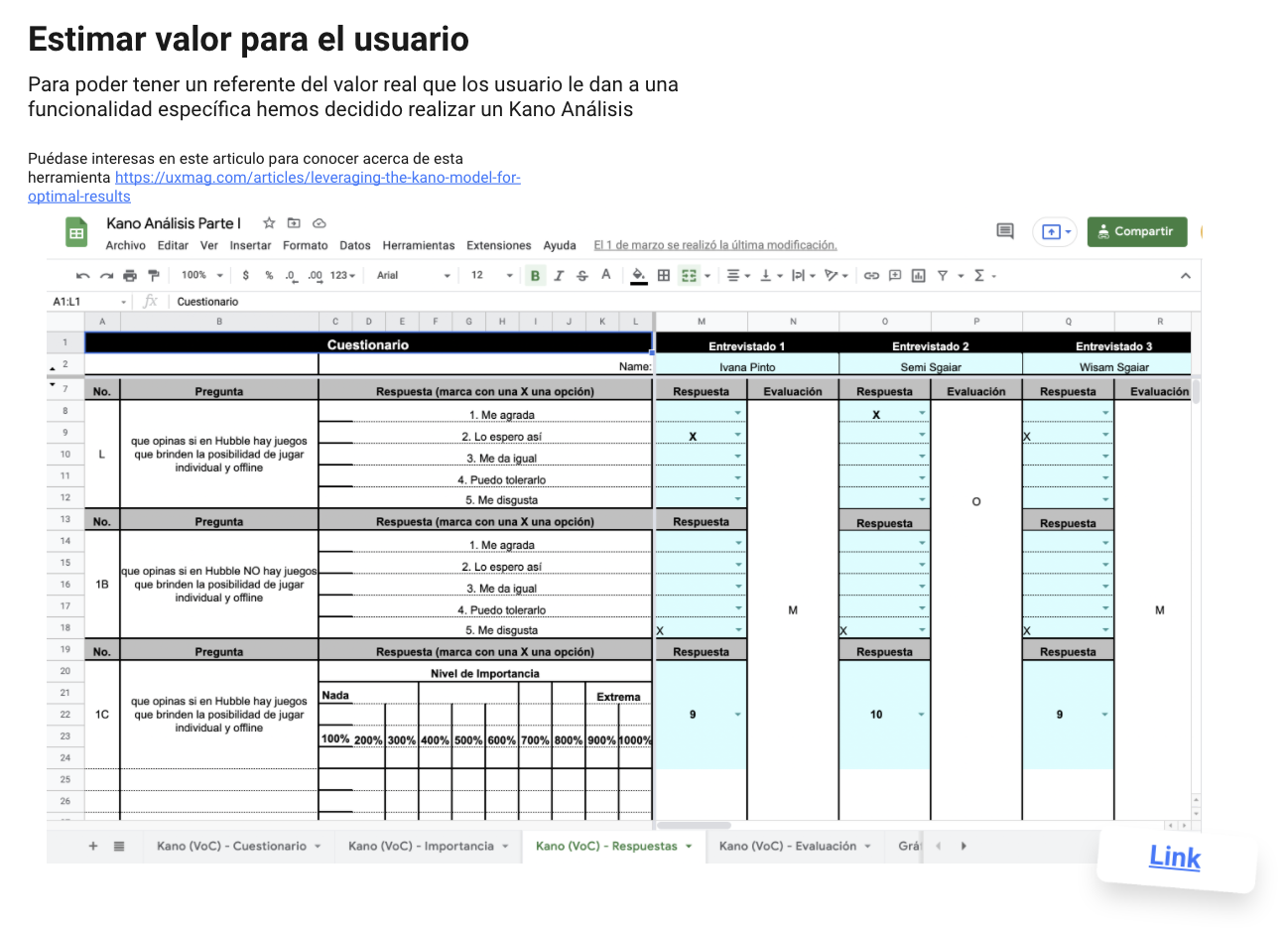
The interviews and workshop opened up many possibilities. We used paired Kano questions to examine how people felt when each feature was available and when it was absent. A separate 1–10 importance rating added another perspective.
Seven people contributed to the workbook. The first three features have seven responses each; the remaining nine have six. Showing the distribution keeps disagreement visible rather than assigning a single category to everyone.
All seven responses were attractive, performance or must-be. Its mean importance was 8.57/10; it was not universally classified as must-be.
8.83/10, with a mixed category distribution. Social play mattered, while expectations differed.
Five of seven responses were indifferent and one reverse. This challenged the appeal of adding timed notifications.
Reconstructed from the original response workbook. Each segment is a response count; bar length is normalised within its sample. Questionable responses: zero for all 12 features. Importance and category answer different questions.
Explore the original Kano analysisFunctional and dysfunctional responses produce attractive, performance, must-be, indifferent, reverse or questionable classifications. Capture gestures had four attractive responses out of six; training rooms had four out of seven. Streaming and spectating were mostly indifferent despite relatively high importance ratings.
This is a small exploratory sample, including contributors who also appear in the workshop. Some questions bundle several capabilities. It is not representative market validation. The later prototype is consistent with solo discovery, social play and achievements, but the workbook alone does not establish that Kano caused a specific release decision.
The original ratings use a 1–10 scale. Percentage formatting in one template view should not be read as a percentage measure.
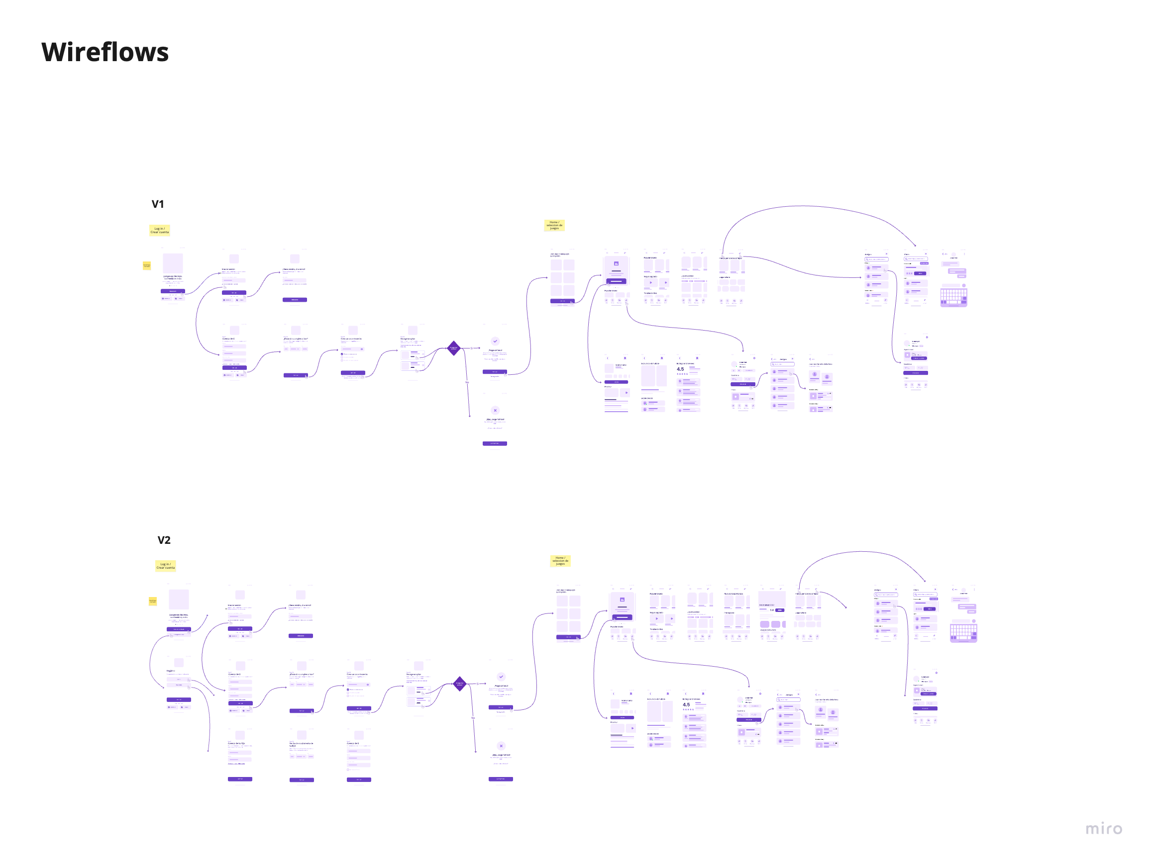
Two low-fidelity wireflow versions connected registration, subscriptions, personalisation and game discovery. Early testing with five people exposed unclear parental account creation, plan comparisons and return paths into games.
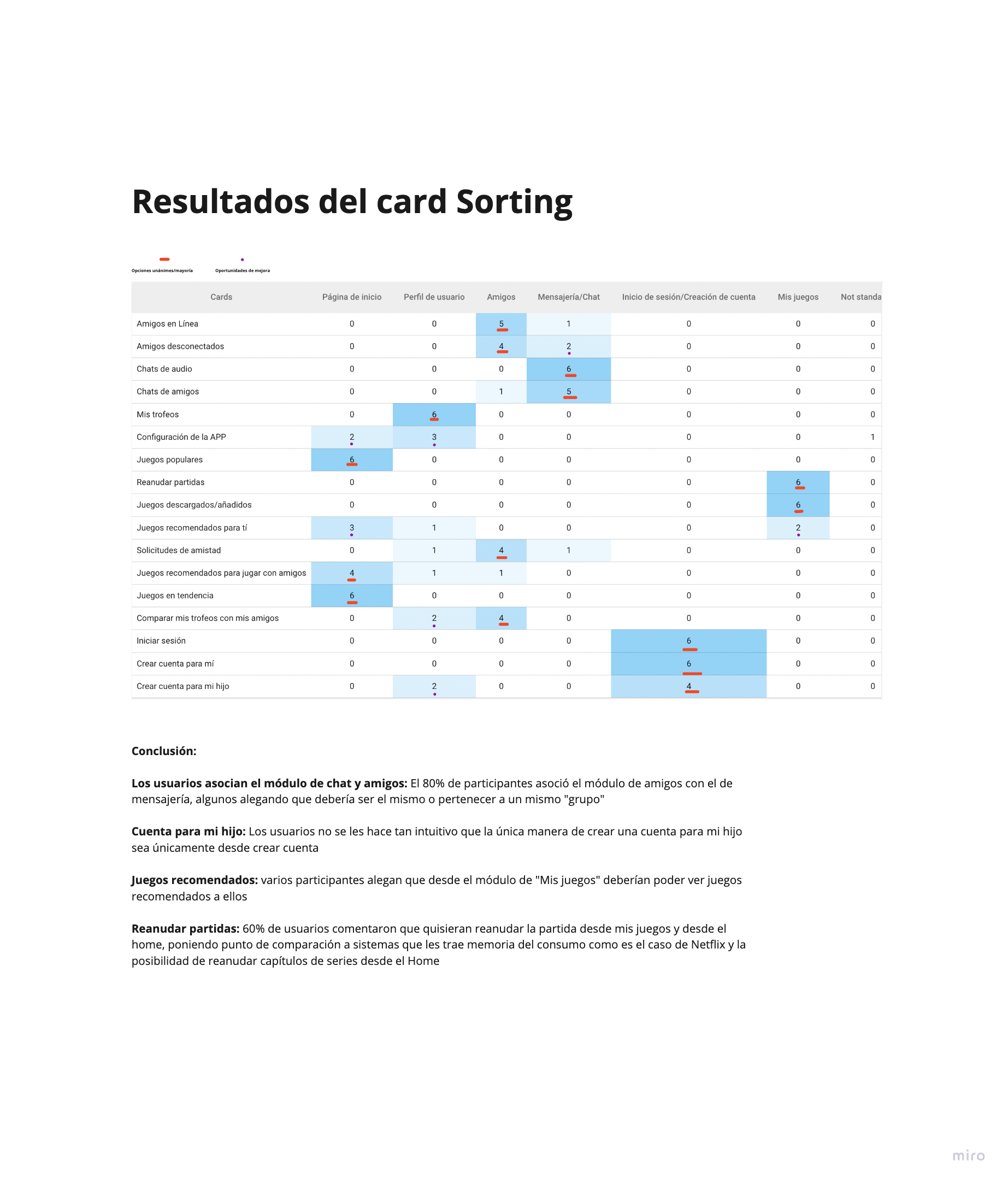
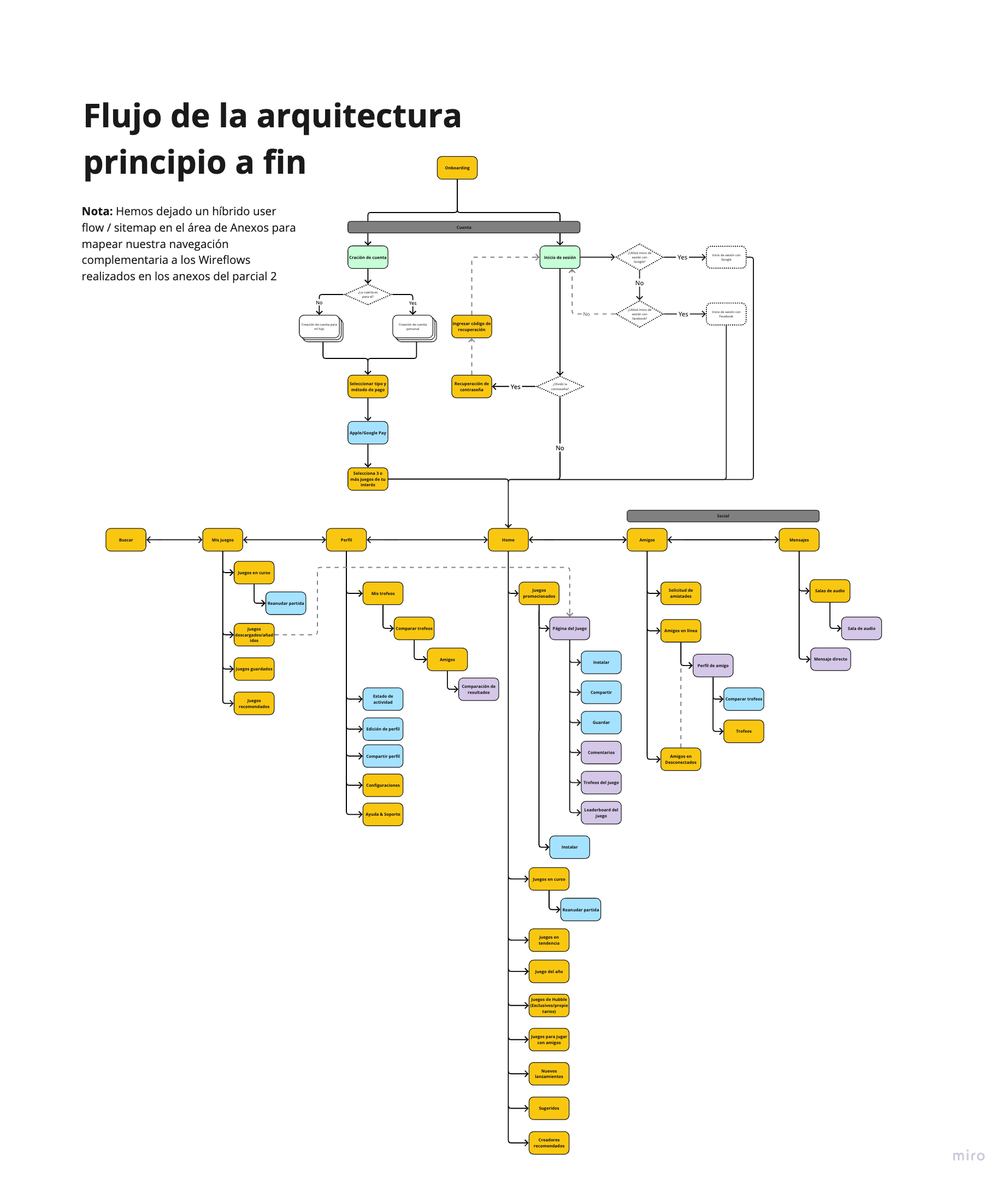
Card sorting gave us both anchors and disagreements. All six participants placed downloaded and resumable games in My games, and trophies in Profile. Comparing trophies split between Friends (4) and Profile (2). Child-account creation split between registration (4) and Profile (2). The structure needed to respect both the task and the starting context.
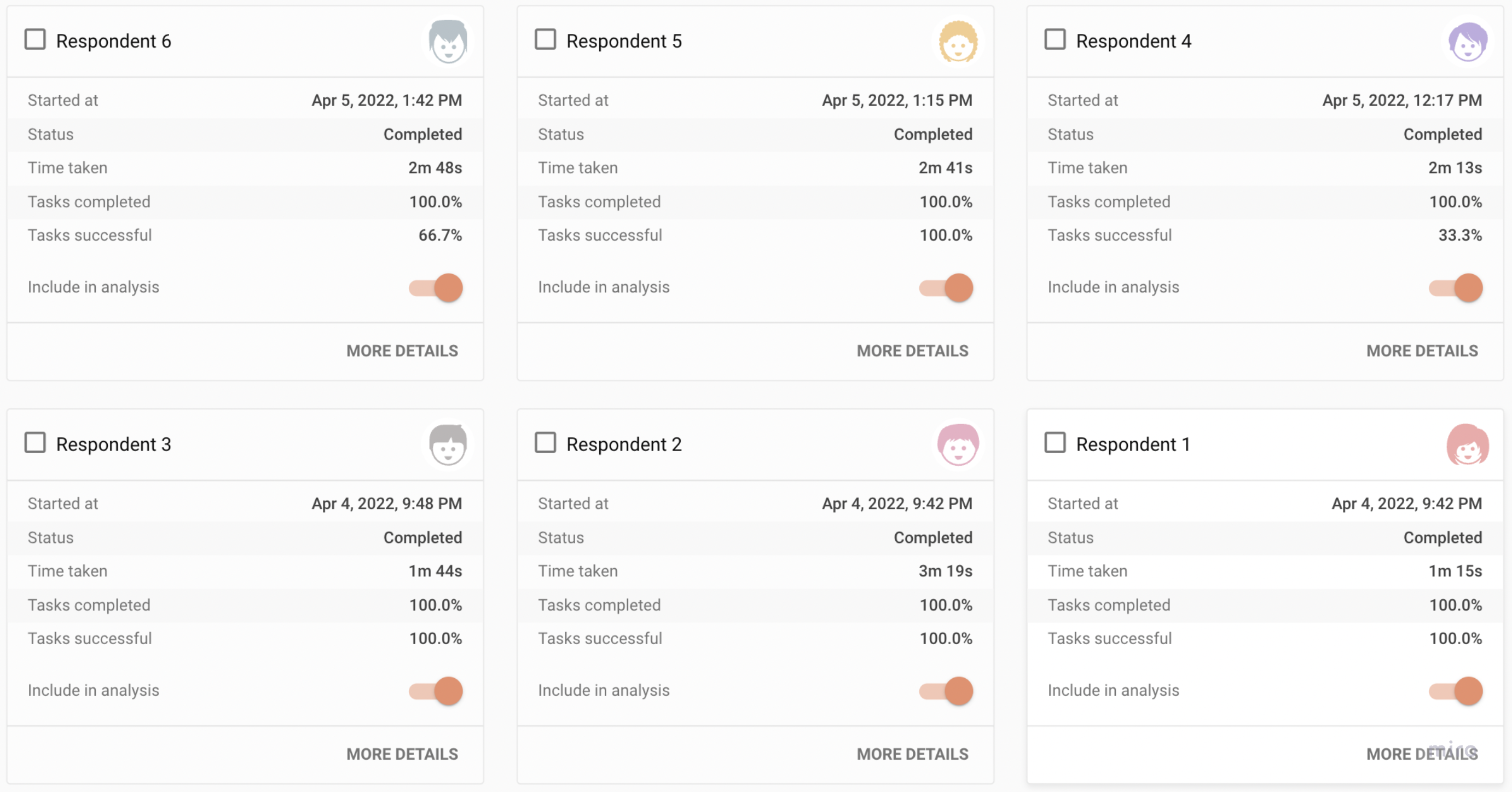
Six people then attempted three tree-test tasks. They reached the correct destination in 15 of 18 attempts, but only six attempts were direct, without backtracking. The distinction mattered: a correct destination did not mean an obvious route.
| Task | Correct destination | Direct success |
|---|---|---|
| Create a child’s account | 4/6 | 1/6 |
| Compare trophies | 5/6 | 3/6 |
| Accept a friend request | 6/6 | 2/6 |
| Total | 15/18 · 83.3% | 6/18 · 33.3% |
Home offered a route back into ongoing games. Social areas became more closely connected, while progress and trophy comparison could be considered from both a personal and a friends context. The child-account route still required particular attention.

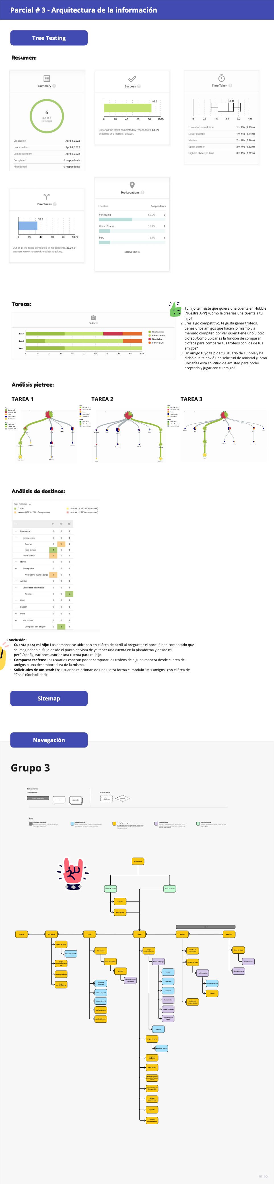
The card-sort commentary includes percentages whose denominator is not documented. The narrative uses the matrix counts instead. These studies diagnose navigation; they do not measure retention, conversion or commercial impact.
The high-fidelity rounds exposed friction beyond navigation. In the first round, three of five people struggled with choosing three favourite games. The child-account flow left people unsure whose details to enter. One of five was frustrated by having to pay before reaching Home.
We documented possible responses: allow game selection to be deferred, make parent labels explicit, and distinguish Profile from Friends more clearly. These were not all verified fixes. The subscription gate remained a design trade-off, rather than a conversion decision backed by launch data.
The second-round report describes easier discovery of Friends. It does not provide a reliable average time improvement.
People appreciated resuming a game and found locating and installing titles intuitive in the tested prototype.
People less familiar with gaming still struggled to understand them in round two. Contextual onboarding remained an opportunity.
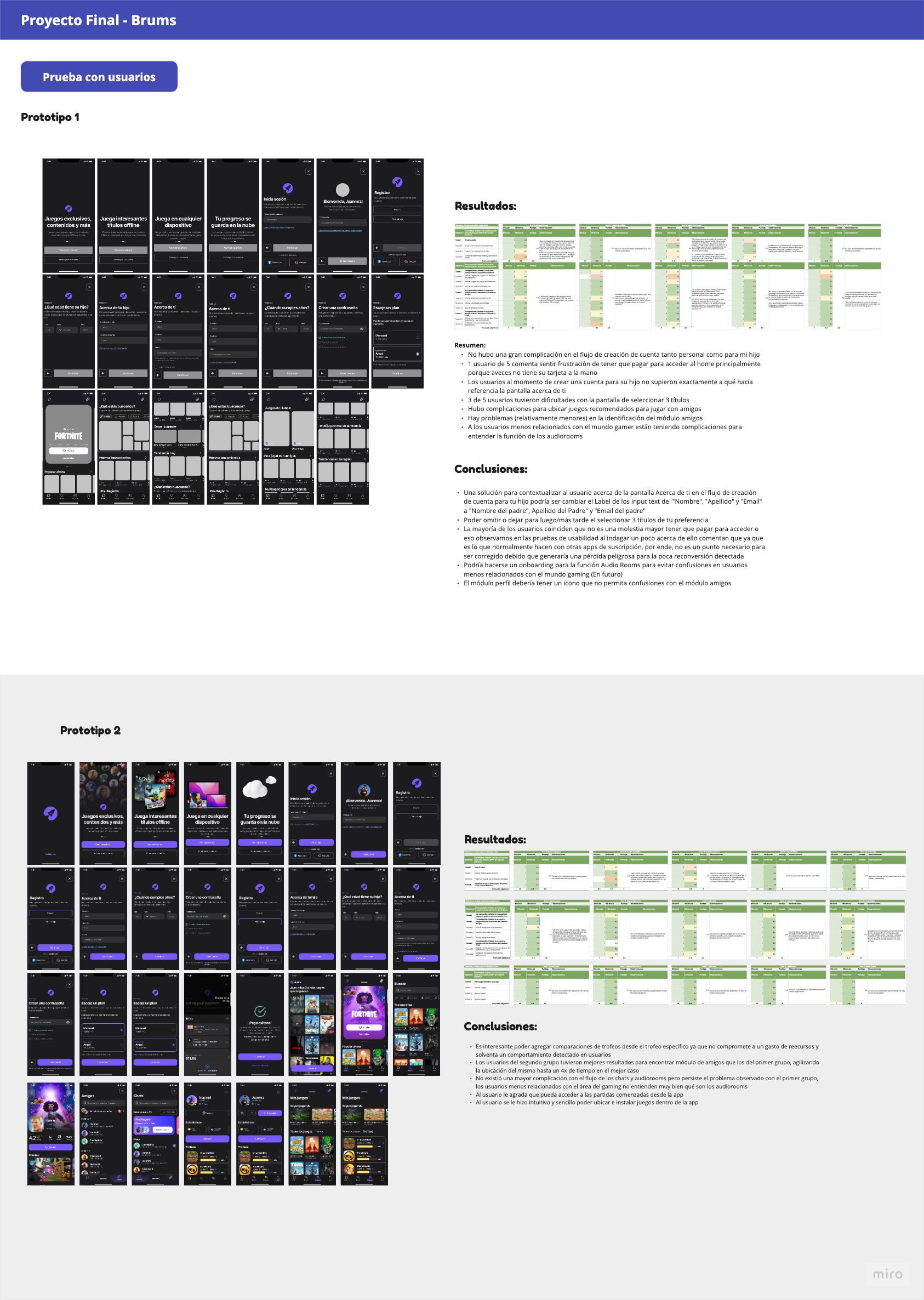
The later screens show distinct social navigation, a library and a trophy-comparison view. The report proposes comparison from a specific trophy; the exact entry point is not established by the static export. Better Friends findability is reported qualitatively. A “4×” best-case statement in the source is not an average result and is not used as a headline here.
Deferring favourite-game selection, clearer parent labels and audio-room onboarding should not be described as resolved without a corresponding retest. The repeated testing-board image represents the same two versions, not an extra study.
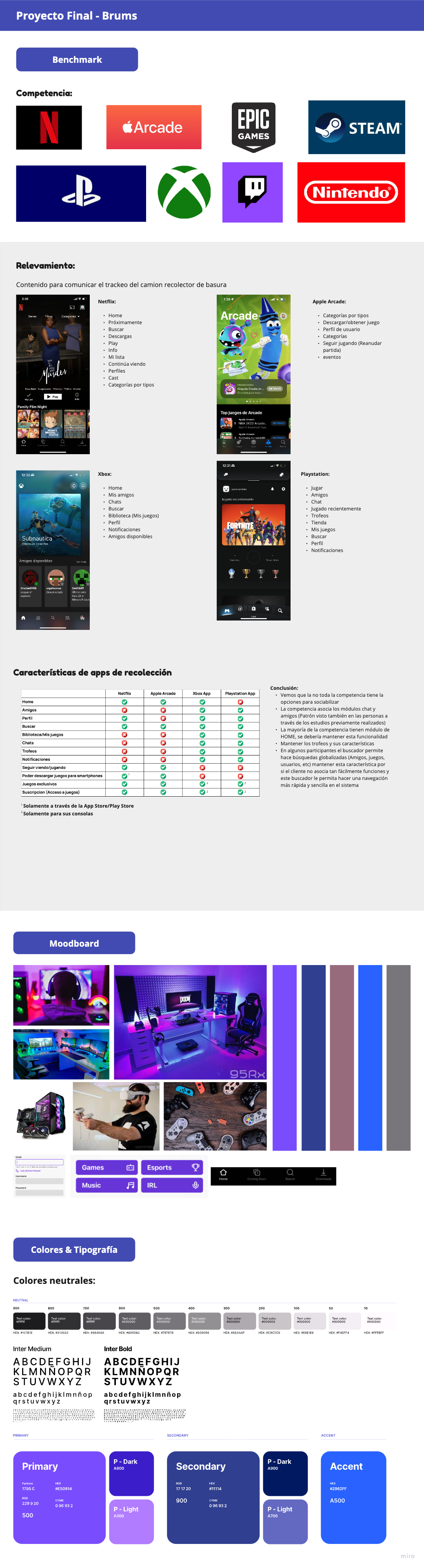
The benchmark examined patterns from Netflix, Apple Arcade, Xbox and PlayStation, with broader gaming references. We considered discovery, libraries, resuming, social access and progress. Those observations fed a gaming-focused moodboard and a dark interface with purple accents.
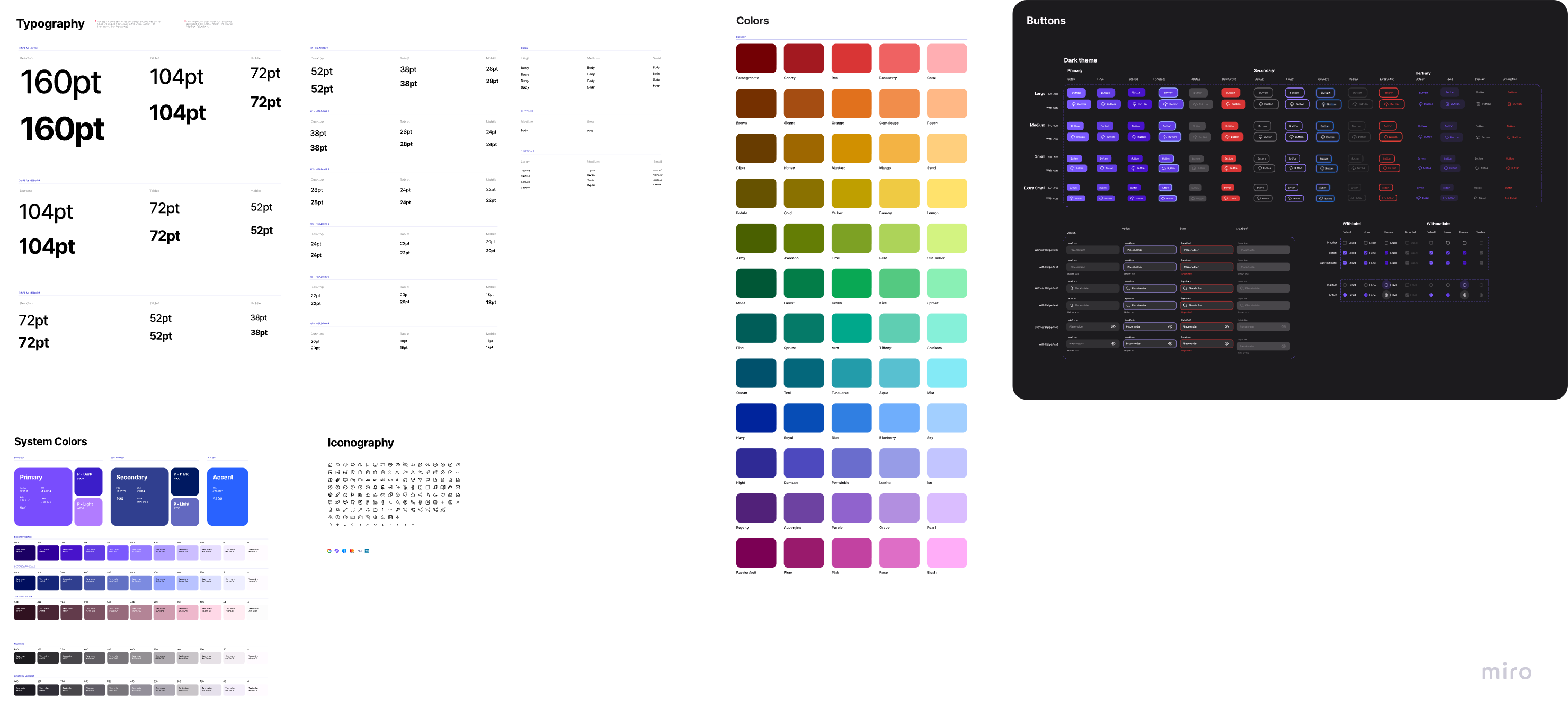
The UI library documents typography, colour ramps, system colours, iconography and component states. Buttons and inputs include size and state variants so repeated interactions can belong to the same interface.
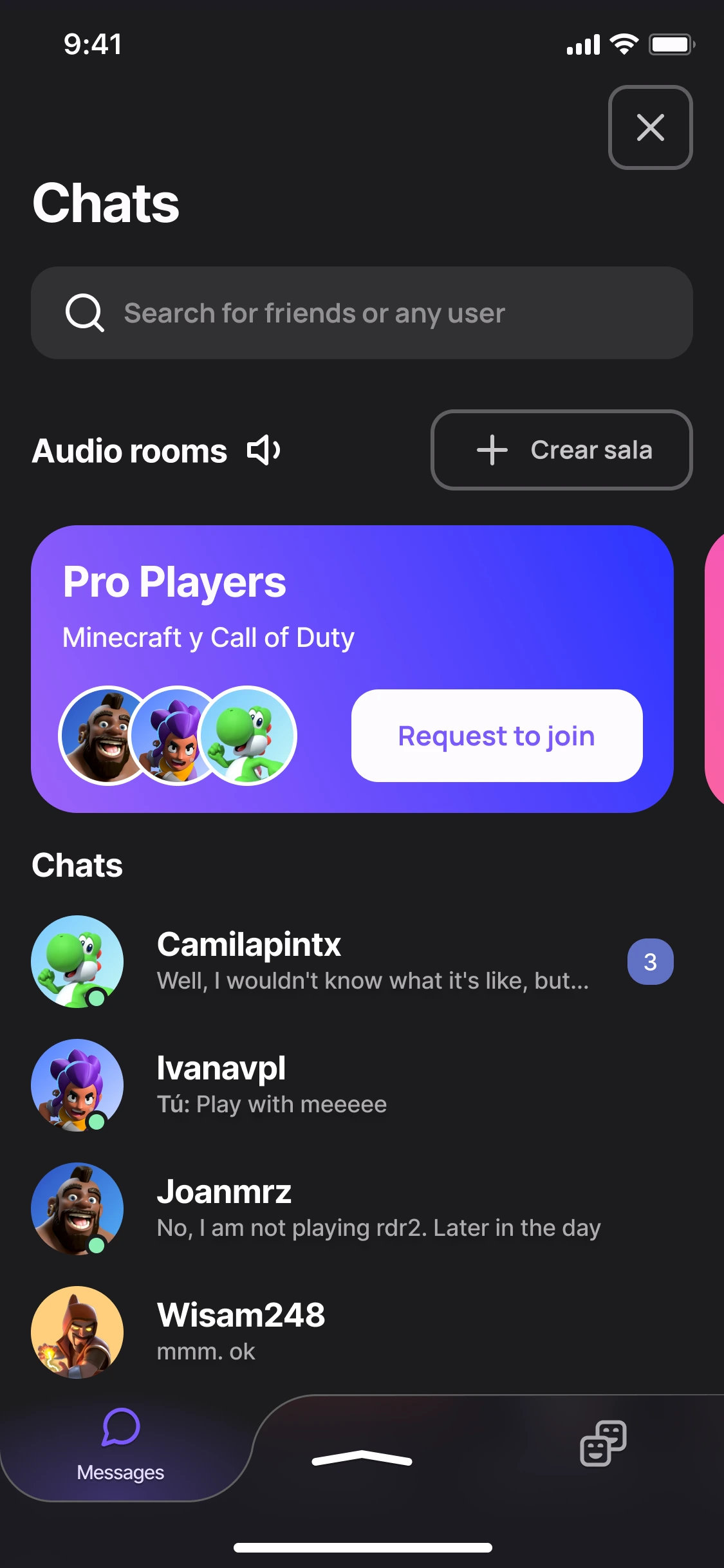
The screens bring those decisions together: onboarding introduces the concept, Home supports discovery, and Friends, Chats and audio rooms organise connection around play. The exported set also includes profile and trophy comparison.
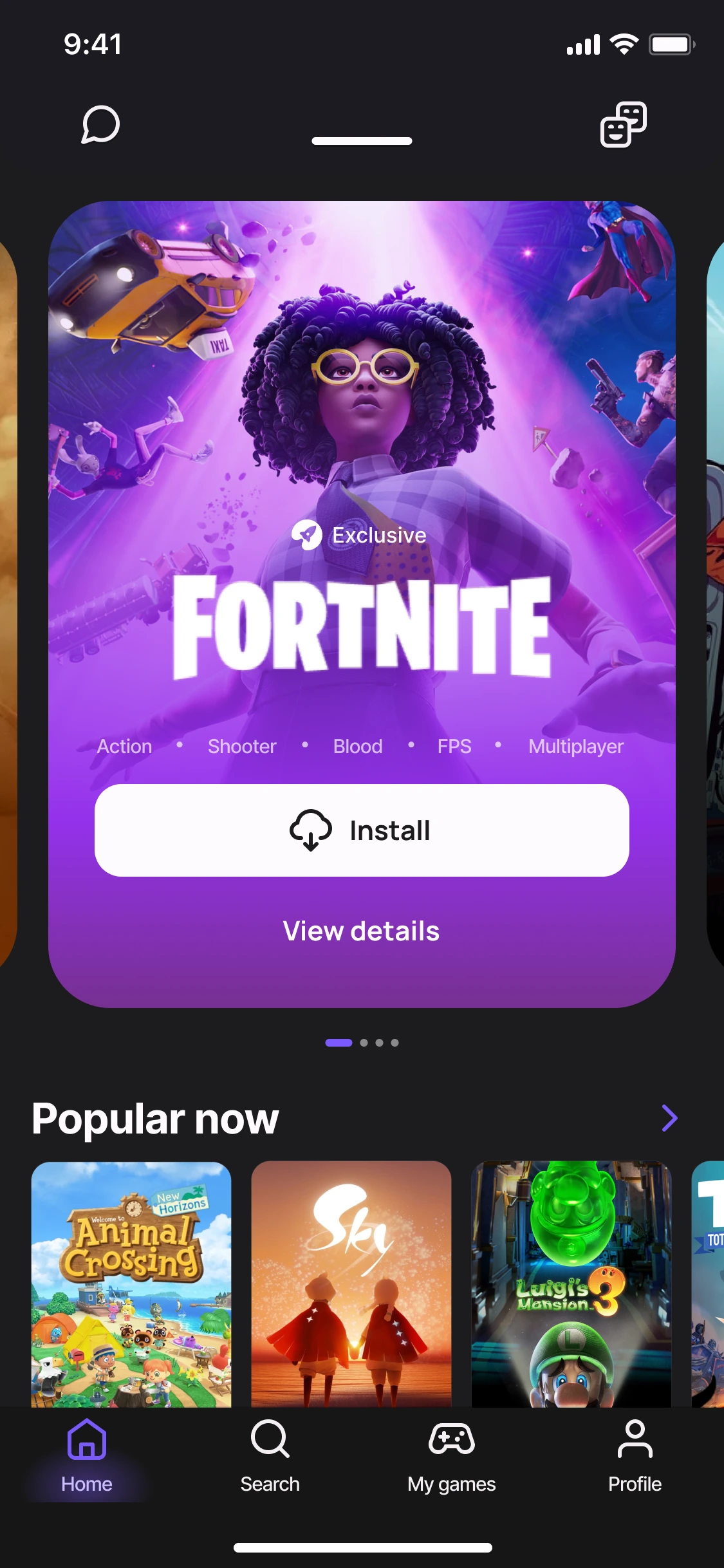
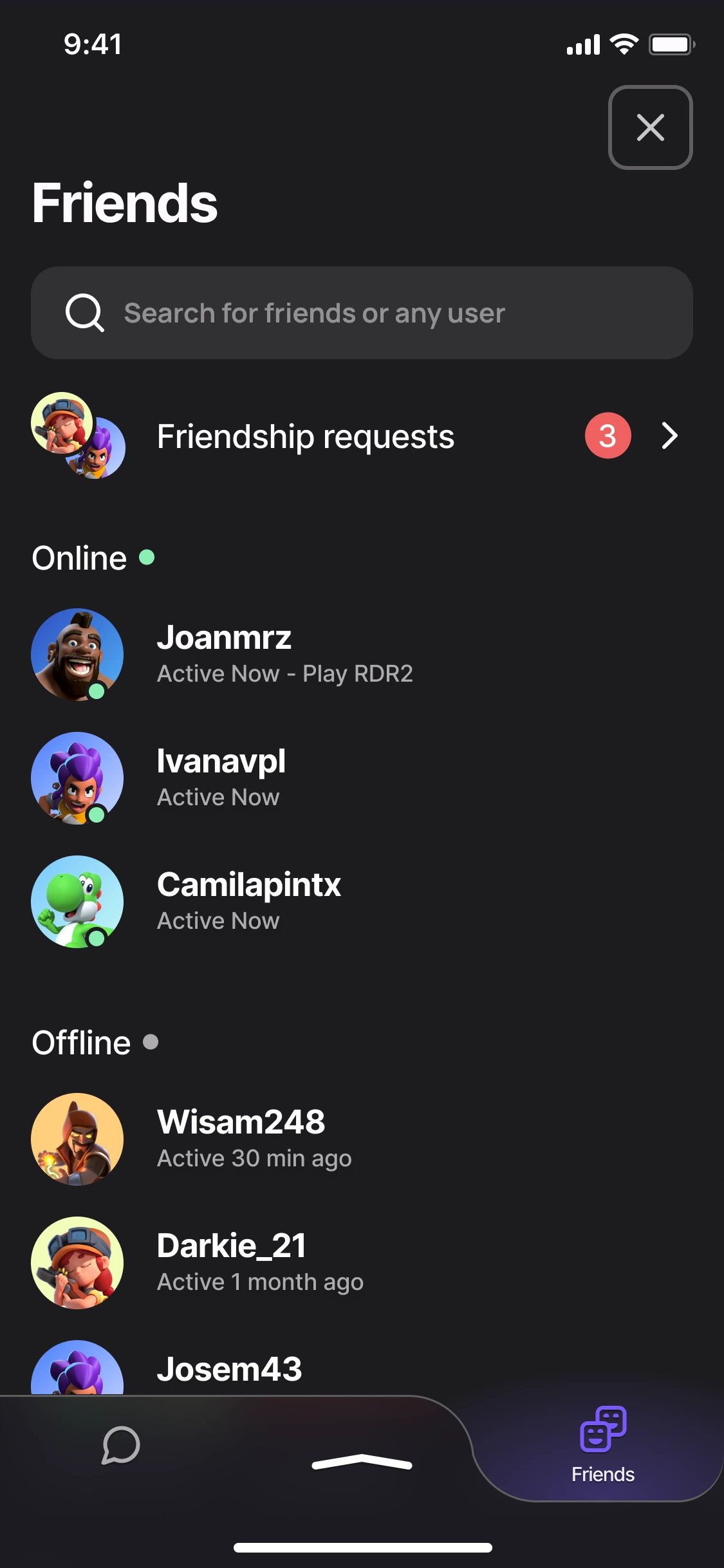
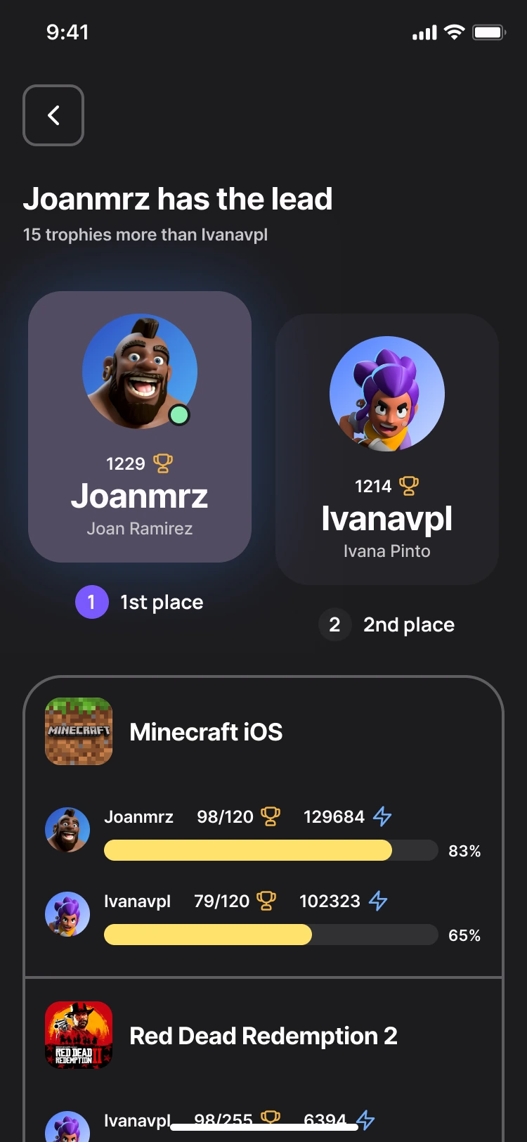
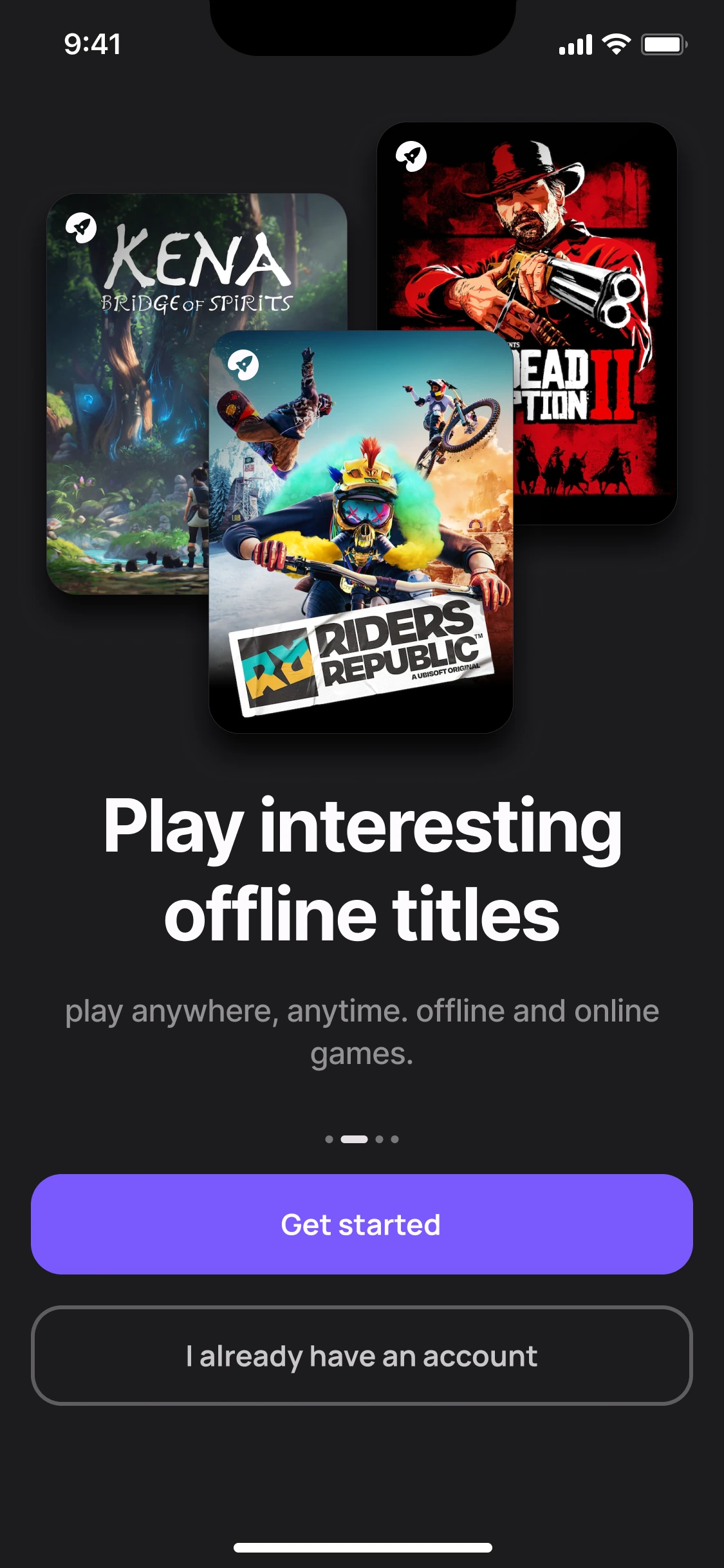
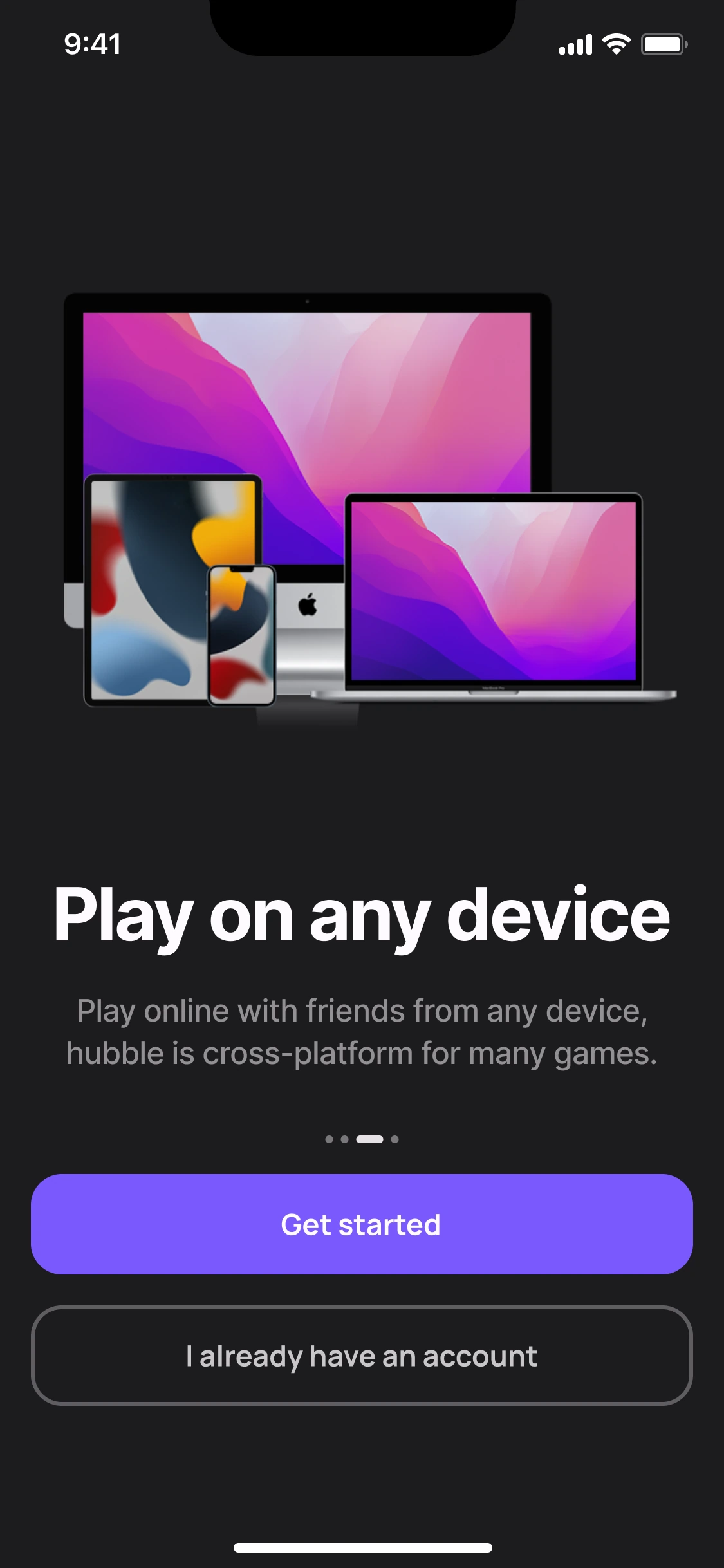
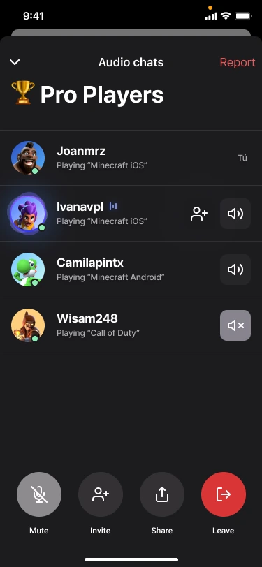
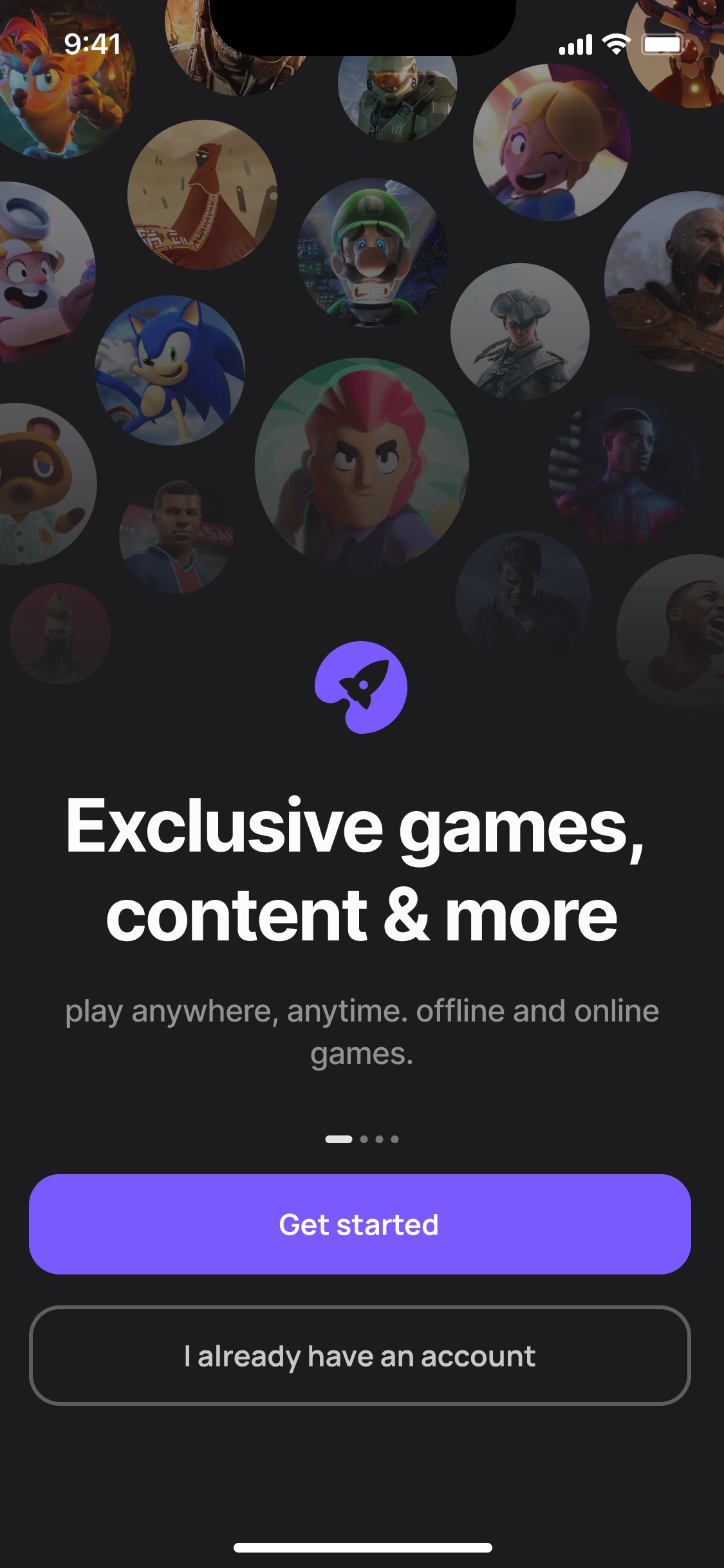
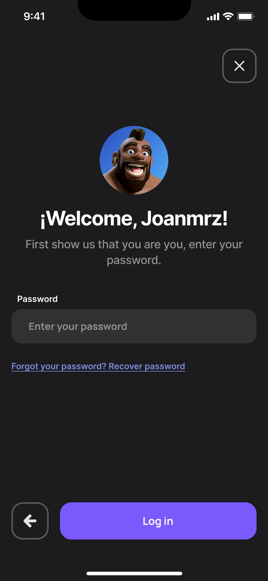
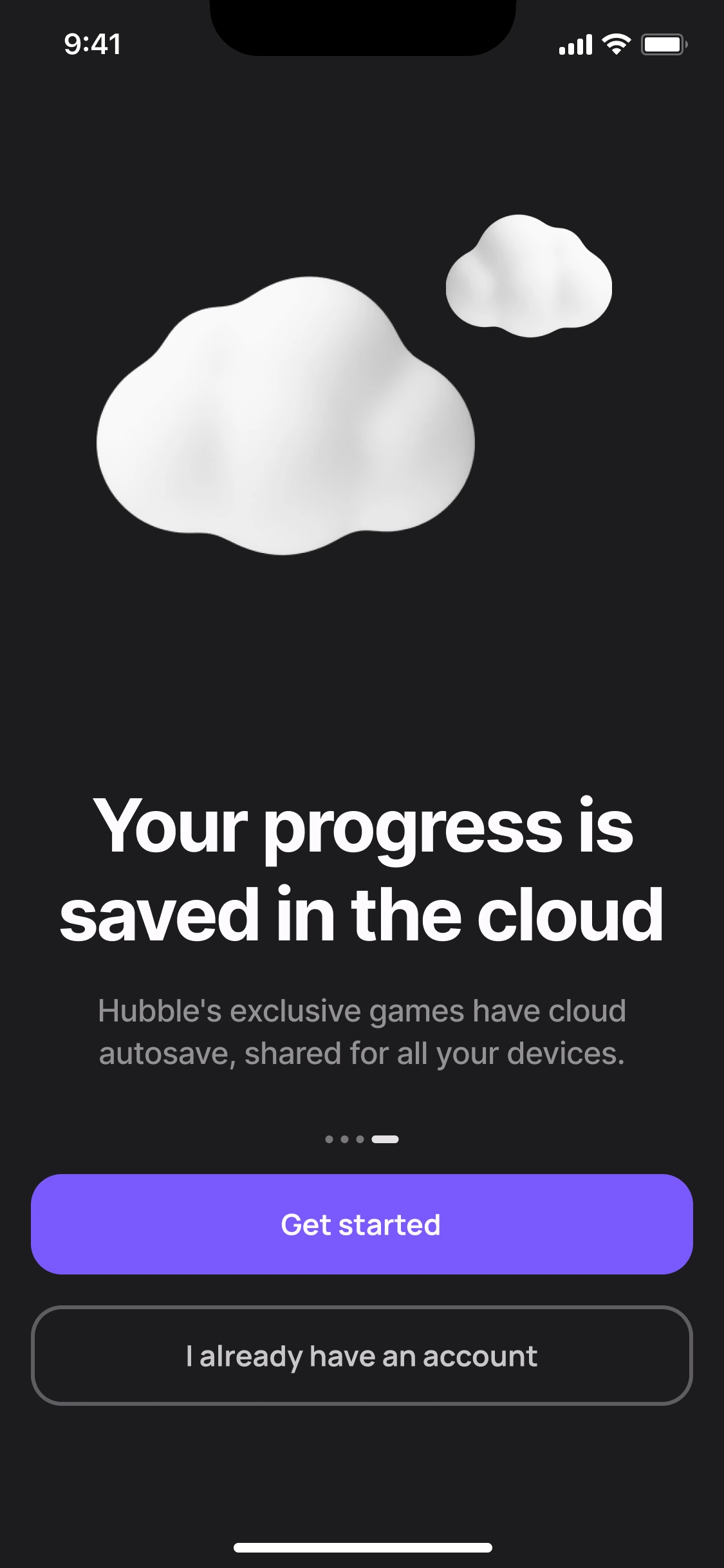
Select “Try the prototype” to interact. Choose “Back to reading” when you want to scroll the case again. You can also open the prototype directly in Figma.
If Figma does not load, open the prototype using the direct link above.
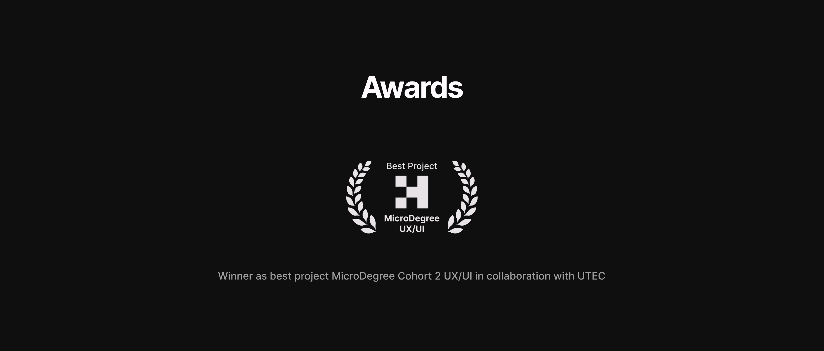
Hubble received Best Project in the UX/UI MicroDegree, Cohort 2, in collaboration with UTEC. The recognition celebrates the project; the research and tests explain the work behind it.
The strongest lesson is the difference between enthusiasm, importance and usability. People could rate a social feature highly and still struggle to understand its interface. They could complete a navigation task and still take a circuitous route. Those distinctions made the next design question more useful.
Today I would recruit beyond the existing network, preserve a clearer decision log linking each finding to its design response, and retest the unresolved audio-room and onboarding questions. I would also separate bundled Kano features so each answer is easier to interpret.
All supplied research topics are retained here. Original artefacts are in Spanish and retain their historical wording. Expand a group, then open an image at full size. The two copies of the high-fidelity testing board document the same study.
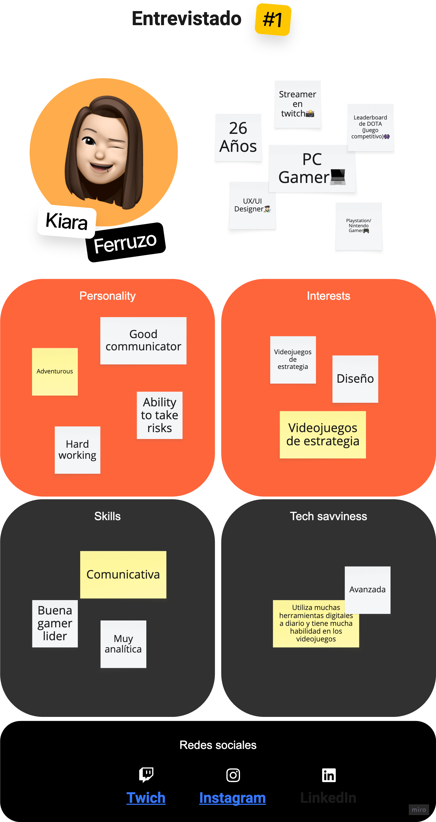
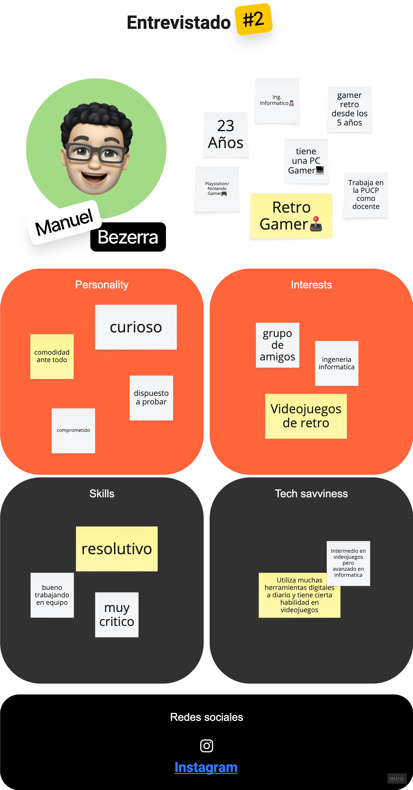
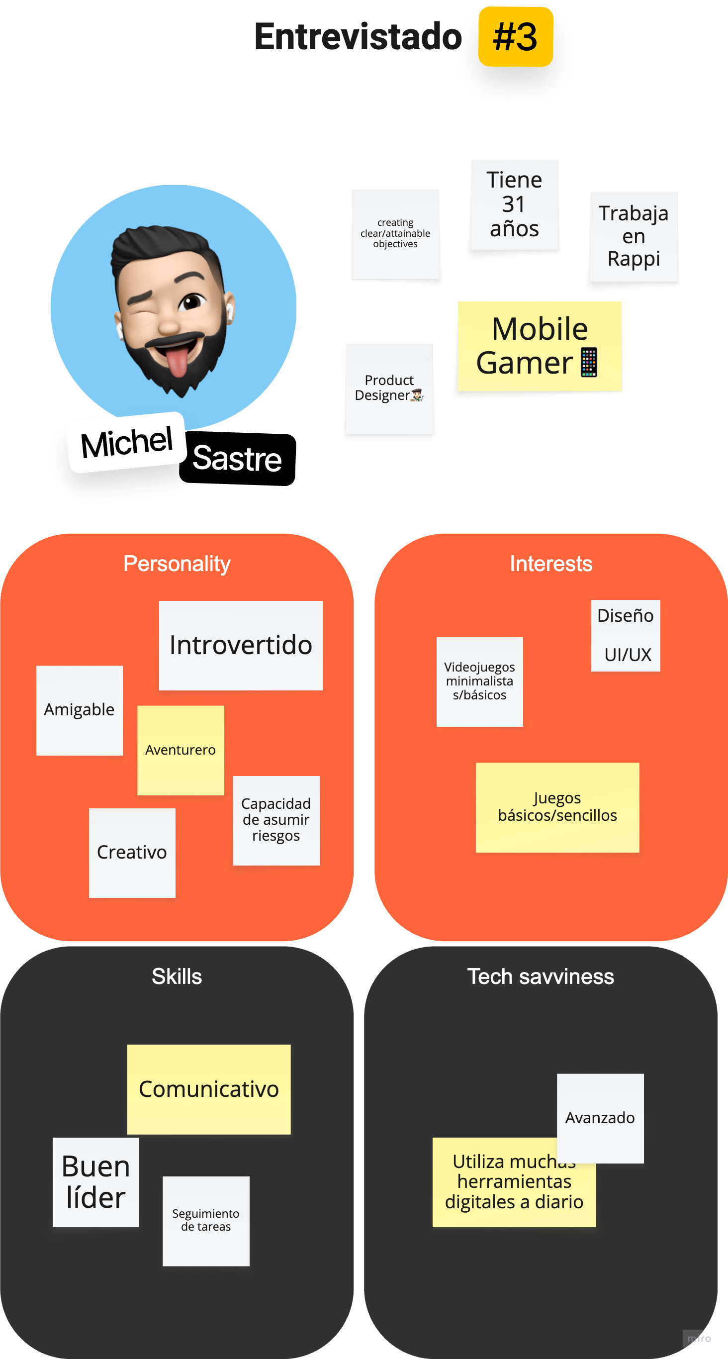
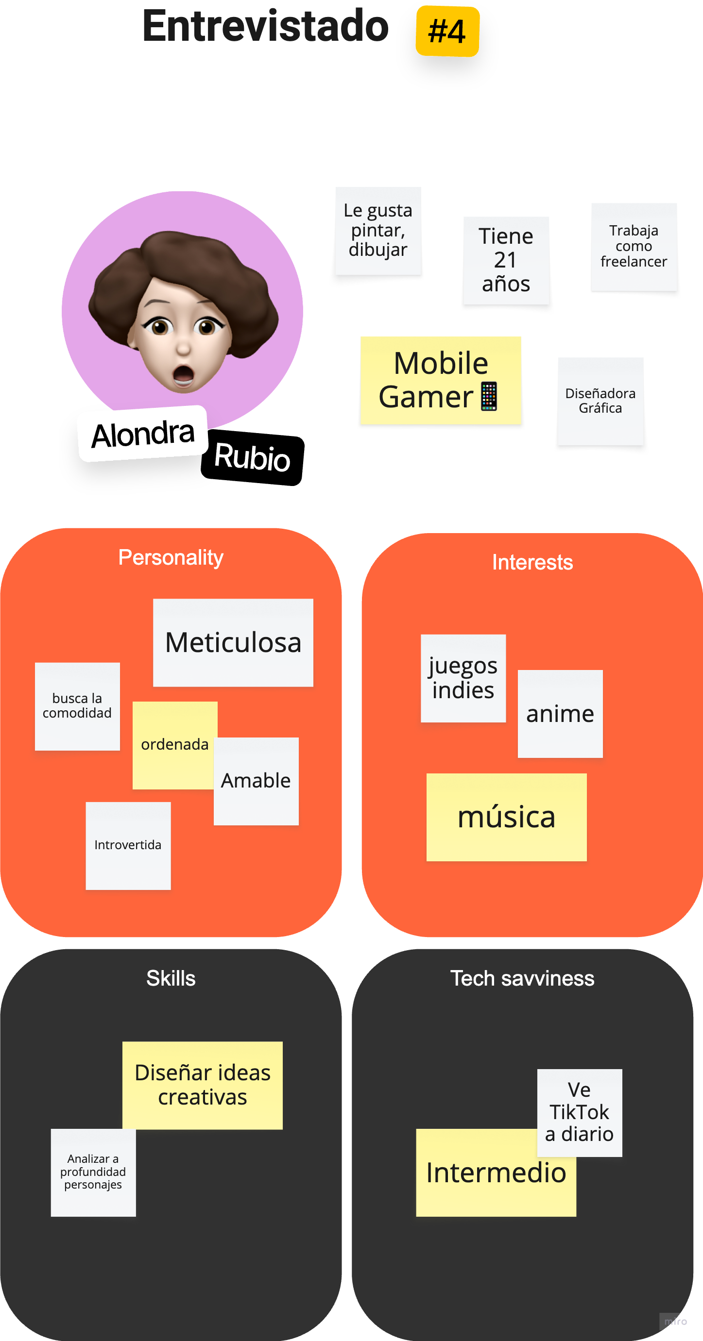
This retrospective case uses the original project canvas, interview synthesis, Kano workbook, prototypes, navigation studies, visual library, supplied exports and award record. The main narrative separates observations, proposed responses and tested outcomes. Legacy “Brums” headings and unrelated template text in a few original boards are not Hubble features.
The editorial structure draws on NN/g’s guidance on UX portfolios and Google’s Design Sprint Kit as references for explaining problems, decisions and testing. Hubble is described through its actual artefacts, not recast as a completed Google Design Sprint.
The study samples differ: five interview profiles, seven Kano contributors with partial responses, six card-sort participants and six tree-test participants. They must not be summed into a unique participant total.