JMRBack to projects
KAMEN / PRODUCT DESIGN CASE STUDY

A reason to
go further.

Exploring how routes, progress and other people can help us keep moving.

Read the story
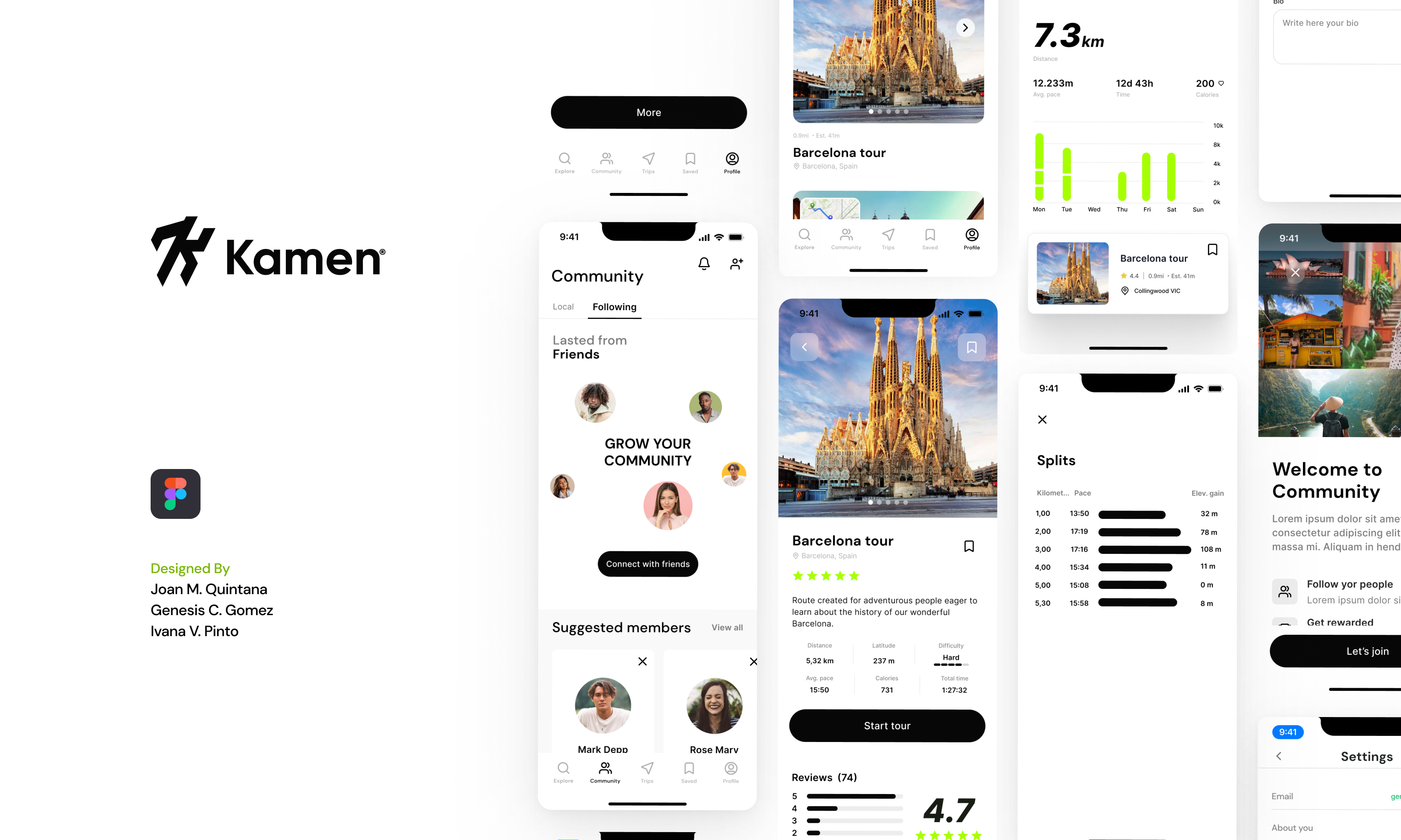
Original Kamen cover with the project logo, design credits and mobile interfaces
01 / THE PROJECT

A running habit.
A wider world to explore.

One runner remembered a short race that was much harder than expected. Another remembered what happened after the finish: music, friends and a reason to stay.

Those accounts sit at the centre of Kamen. A route can be a physical challenge, a way to discover somewhere new, or time spent with other people. The design brings these motivations into one mobile experience.

The early research explored sporting habits and disrupted race routines during the pandemic. The route-planning interview guide also explored active travel: how people plan outdoor activities, choose places and judge whether a route suits them. The final screens connect route discovery, saved trips, activity records and community.

Scope
UX research & mobile UI
Collaboration
Team project
Deliverable
Mobile app design
Published
2023 / Behance

The design question

How could we help someone choose a route they feel prepared for, make it part of their routine and share the experience?

This case follows the work from its research materials to the interface. I have revisited the archive to explain the connections more clearly. New interpretations and improvements are labelled as a retrospective; the screens and sketches remain the original work.

Project context & credits

The published design credits Joan M. Quintana, Genesis C. Gomez and Ivana V. Pinto. The interview guide also contains Genesis’s introduction. This is shared team work; individual ownership of each activity has not been reconstructed.

The archive contains materials from different stages. The 2023 date refers to the published presentation, not a verified project start or duration. The two surviving paper sheets have a “hubble wireframes” template heading, while their screens contain the Kamen name or mark. They are shown here as supplied, without relabelling the originals.

02 / LISTENING

Start with
the last run.

The topic list covered sporting experiences, how people discover and pay for events, and what happens during an activity. It asked about the best and worst experiences, unfinished challenges, competition and the role of technology.

The route-planning guide added habits, travel motivations, safety, transport and spending. Together, the documents show an attempt to understand what surrounds the activity, rather than treating a run as a line on a map.

IN-PERSON / DAILY ROUTINES

The day around
the activity.

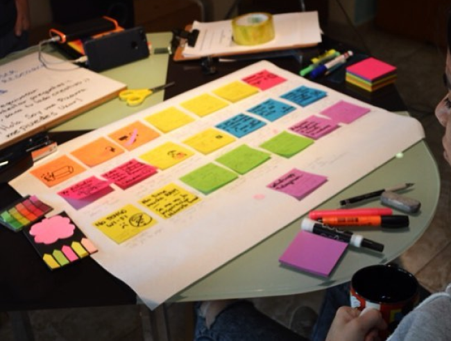
We invited users to describe their day-to-day lives and mapped their accounts on a large paper board with sticky notes. The exercise brought everyday routines into the conversation: where physical activity fitted and what surrounded it.

We used the board to look for shared habits and triggers. Alongside the interviews about particular sporting experiences, it gave us a way to explore activity in the context of an ordinary day.

Original workshop photograph. The surviving image records the exercise; its handwritten notes are not clear enough to reconstruct individual findings.

Large paper board on a workshop table with colourful sticky notes used to map users’ daily routines
Daily routines, mapped together on paper.
01

Before setting out

How do people find an activity? What do they need to know before committing to it?

02

During the activity

What makes a route harder than expected? What support do people rely on?

03

After finishing

What makes the experience worth repeating? Where do friends and personal progress fit?

What the archive can tell us

The written results preserve two participant accounts. The interview board contains notes for three people and two unfilled template columns. These are exploratory accounts; the empty columns are not additional participants, and the materials do not establish the full study sample.

The team also held a focus group and an in-person brainstorming session using Google Design Sprint methods. Those sessions are part of the project history, but their detailed records are not in this archive. I use the surviving interview notes for the findings below.

A stronger interview guide, using the same topics

Retrospective rewrite. These prompts improve the original guide; they are not presented as questions already asked.

  1. Reconstruct a recent activity. “Tell me about the last time you planned a run or an outdoor route. Where did you start?”
  2. Follow the actual decision. “What did you look at before choosing it? Was there anything you could not find?”
  3. Explore a difficult moment. “Tell me about a time the route felt different from what you expected. What happened next?”
  4. Understand the social context. “Who else was involved? How did that change what you did?”
  5. Discuss cost through an example. “Walk me through the last event or activity you paid for. What made it worth the money?”
  6. Close with what mattered. “What would you repeat about that experience? What would you avoid?”

The original introduction described the proposed app before asking about habits, and several prompts asked which features people would value. I would move the concept discussion to the end and begin with recent experiences. That gives participants more room to describe problems in their own terms.

Why the methods answer different questions

Interviews preserve personal accounts. A focus group can reveal opinions and differences in a discussion. Neither establishes whether someone can complete a task in the interface. That requires observing use of a prototype or product. This distinction follows NN/g’s guidance on focus groups.

The record does not include recruitment criteria, session lengths or a usability-test report. I have not used those gaps to manufacture a sample size, test score or claim of validation.

03 / MAKING SENSE OF THE NOTES

Distance was only
part of the story.

The original board groups notes by participant. For this case, I have regrouped the surviving observations into themes, keeping the source of each one visible. This is a retrospective synthesis, not a claim that the team produced this exact diagram at the time.

01

Knowing the distance did not mean knowing the effort.

Participant P01 described unexpected steep climbs in a relatively short race. P02 knew about the climbs and chose the challenge anyway. Both accounts point to the need for better preparation, but they describe different appetites for difficulty.

Design implication: put distance, terrain and difficulty where people choose a route. A “hard” label still needs enough context to be useful.

Source: interview results, pp. 2-3; participant notes.
02

Other people were part of the motivation.

P01 discovered an event through friends and social media, and wanted to repeat a scenic route with friends. P02 described being encouraged to run farther by another person and enjoying time together after a race.

Design implication: give shared routes and people a place in the experience. These accounts support exploring community; they do not prove that a social feed will improve retention.

Source: interview results, pp. 2-3.
03

Progress had a personal starting point.

P02 described beginning with short runs and gradually taking on longer distances. The board also records interest in knowing the time spent on a route and syncing activity with an existing watch.

Design implication: make personal activity history easy to review. Comparisons with other people should not be the only way to understand progress.

Source: interview results, p. 3; participant P02 board notes.
04

Support during a route was a separate problem.

The notes mention hydration, medical assistance and knowing where someone is during an activity. Those concerns extend beyond route discovery and into the reliability of support on the ground.

Design boundary: a map or activity screen does not establish emergency coverage. The supplied design does not demonstrate a working safety service.

Source: interview results, p. 2; participant P03 board notes.
RESEARCH WALL / 01

From individual accounts
to shared themes.

Affinity map

Two documented interviews, grouped retrospectively. Two generated scenarios add questions to explore; they do not count as research findings.

P01 + P02 · Interview evidenceH01 + H02 · Generated hypotheses
01

Choose with confidence

P01 / DOCUMENTED

A short race turned out to have unexpectedly steep climbs.

Interview · p. 2 · paraphrase
P02 / DOCUMENTED

Knew about the climbs and chose the challenge anyway.

Interview · p. 3 · paraphrase
H01 / HYPOTHETICAL

Might need a gentler route and a clear explanation of its difficulty.

Generated scenario · Returning runner
DESIGN QUESTION ↘

Explore how to communicate effort before someone commits.

02

Make room for company

P01 / DOCUMENTED

Discovered an event through friends and social media.

Interview · p. 2 · paraphrase
P02 / DOCUMENTED

Enjoyed spending time with friends after the race.

Interview · p. 3 · paraphrase
H02 / HYPOTHETICAL

Might need to find an outing that suits friends with different abilities.

Generated scenario · Weekend organiser
DESIGN QUESTION ↘

Explore shared routes without assuming everyone wants competition.

03

Notice personal progress

P02 / DOCUMENTED

Started with short runs and gradually went farther.

Interview · p. 3 · paraphrase
P02 / DOCUMENTED

Wanted to understand time spent on a route and sync an existing watch.

Original board · paraphrase
H01 / HYPOTHETICAL

Might compare an outing with a recent personal baseline rather than a leaderboard.

Generated scenario · Returning runner
DESIGN QUESTION ↘

Explore an activity history people can interpret at their own pace.

04

Prepare for the outing

P01 / DOCUMENTED

Remembered encouragement and support around hydration points.

Interview · p. 2 · paraphrase
P01 / DOCUMENTED

Wanted to know the actual position along a route.

Original board · paraphrase
H02 / HYPOTHETICAL

Might check meeting points and route details before inviting the group.

Generated scenario · Weekend organiser
DESIGN QUESTION ↘

Explore preparation needs; a map alone does not provide on-route assistance.

P01 and P02 refer to the two written accounts. H01 and H02 are invented exploratory cases, not additional participants. Grouping and implications are a current synthesis.

Proto-personas were starting assumptions.

The two original profiles shared an interest in aerobic activity, challenges and new experiences. One leaned toward personal achievement; the other toward competing and spending time with friends. Both assumed mobile access and different levels of digital confidence.

Those profiles helped frame questions. They were not validated user segments. The most useful distinction to carry forward is behavioural: what someone wants from a particular outing.

PROTO-PERSONA / A · HYPOTHESIS

The personal challenger

Self-directed activity · Personal milestones

A challenge at my own pace.

01Starting assumptions

Adult who enjoys running or cycling

Uses a smartphone; digital confidence may vary

02Friction to investigate

Disrupted race routines reduce opportunities for a challenge

Wants to participate but may struggle to find motivation

03Behaviour to explore

Exercises for enjoyment and personal improvement

Looks for adventure and new challenges

04Needs to test

Enough information to choose a suitable level of effort

A sense of achievement from personal progress

Refined from the original proto-persona canvas. Assumptions to investigate, not a validated segment or participant quotation.
PROTO-PERSONA / B · HYPOTHESIS

The shared-experience seeker

Social activity · Shared challenges

An outing worth sharing.

01Starting assumptions

Adult interested in aerobic sport

Mobile user with moderate digital confidence

02Friction to investigate

Fewer sporting events mean fewer shared challenges

Motivation may depend on having something to work toward

03Behaviour to explore

Enjoys training as a hobby and competing with friends

Seeks new experiences while being active

04Needs to test

Ways to involve friends in an activity

Recognition for completing a meaningful challenge

Refined from the original proto-persona canvas. Assumptions to investigate, not a validated segment or participant quotation.
04 / CHOOSING WHAT TO EXPLORE

A feature list
is not a priority order.

The Kano questionnaire explored nine feature groups. For each, it asked how someone would feel if the feature existed, how they would feel if it did not, and how important it was. That structure could help distinguish expectations from additions people would appreciate.

The surviving form is the research instrument. Without its response data, I cannot assign a Kano category or claim a ranked backlog. Instead, the table below connects what was explored with what is visible in the supplied screens.

Questionnaire topics → visible interface coverage
Topic exploredWhat the screens show
Height, weight and age at entryA profile exists; that intake sequence is not shown.
Challenges, events, filters and registrationExplore and route detail; event registration is not demonstrated.
News feedA community feed with route content and social actions.
Runner communitySuggested members, following and a connection screen.
NotificationsA notification icon; no complete notification flow.
Digital medalsNo dedicated medal flow in the supplied screens.
Activity statisticsProfile progress, summaries and split times.
Motivational messagesNo dedicated message sequence in the archive.
A visual map of challengesMap-based exploration and an active-trip screen.
Original Kano questionnaire
How I would refine the questionnaire today

The event question combines browsing, filtering and registration. The feed and community questions overlap, as do notifications and motivational messages. I would separate these behaviours so each answer refers to one understandable capability.

I would also separate height, weight and age rather than treating them as one requirement. A respondent might accept one and reject another. The need for each piece of information should be clear before asking for it.

The paired answers would need to be classified before interpreting satisfaction, with contradictory responses inspected and importance kept as a separate measure. The method is described in NN/g’s overview of prioritisation methods. The refinements here are recommendations for a new study, not an analysis of missing responses.

05 / WORKING TOGETHER

Give the team something
to react to.

The team worked in person on a focus group, brainstorming and paper wireframes. Google Design Sprint methods supported the ideation session. The surviving material gives us a view of that work, but not a day-by-day account of a complete sprint.

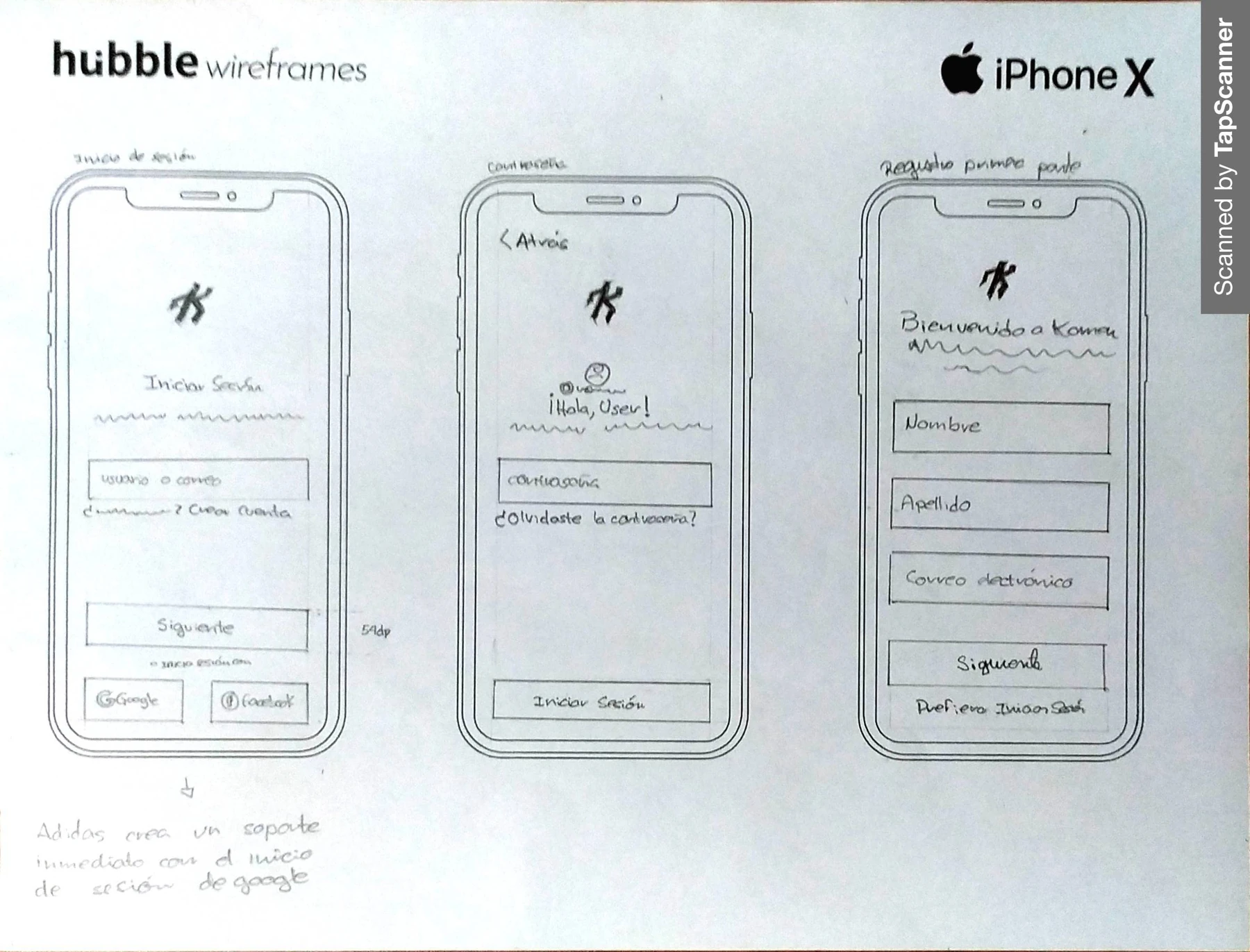
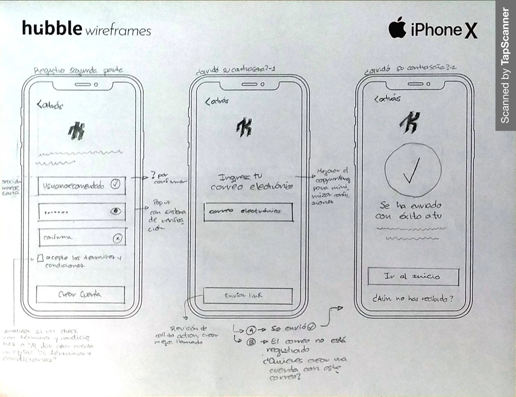
Paper made it possible to discuss an interaction before polishing it. The retained sheets focus on entry to the app: signing in, registering and recovering access. Their annotations ask concrete questions about confirmation, errors and what happens next.

Paper sketches for Kamen sign-in and registration
Entry / Account creation
Paper sketches for Kamen password confirmation and recovery
Confirmation / Recovery

Original paper wireframes, rotated for reading. These are the surviving sheets, not a reconstruction of the full workshop.

The small decisions are visible.

The sketches explore social sign-in and an option to start without registering. Notes call out password confirmation, terms, recovery feedback and the case where an email is not registered. These details show the team thinking beyond a single successful path.

They also raise questions I would resolve differently today: can someone explore without an account, is the reason for registration clear, and does account-recovery messaging protect whether an address is registered? The supplied screen exports do not include the final authentication flow, so these sketches cannot be presented as a tested before-and-after improvement.

How this relates to a Design Sprint

Google’s Design Sprint Kit describes understanding, defining, sketching, deciding, prototyping and validating. The project record supports research, collaborative ideation and design artefacts. It does not document every phase, a five-day schedule or a completed validation round.

The sequence used in this case is a way to explain the evidence. It should not turn a messy collaborative process into an invented linear timetable.

06 / THE EXPERIENCE

Choose a route.
Make it your own.

The exported screens organise the experience into Explore, Community, Trips, Saved and Profile. These sections support a loop: discover something, decide whether it fits, head out, then return to the activity or the people around it.

The walkthrough connects original screens with needs in the research. Where the design rationale was not recorded at the time, it is explained here as a retrospective reading, not as a documented decision log.

  1. 01Find somewhere
  2. 02Judge the fit
  3. 03Head out
  4. 04Keep & share
06.1 / EXPLORE & DECIDE

Make the choice
before the commitment.

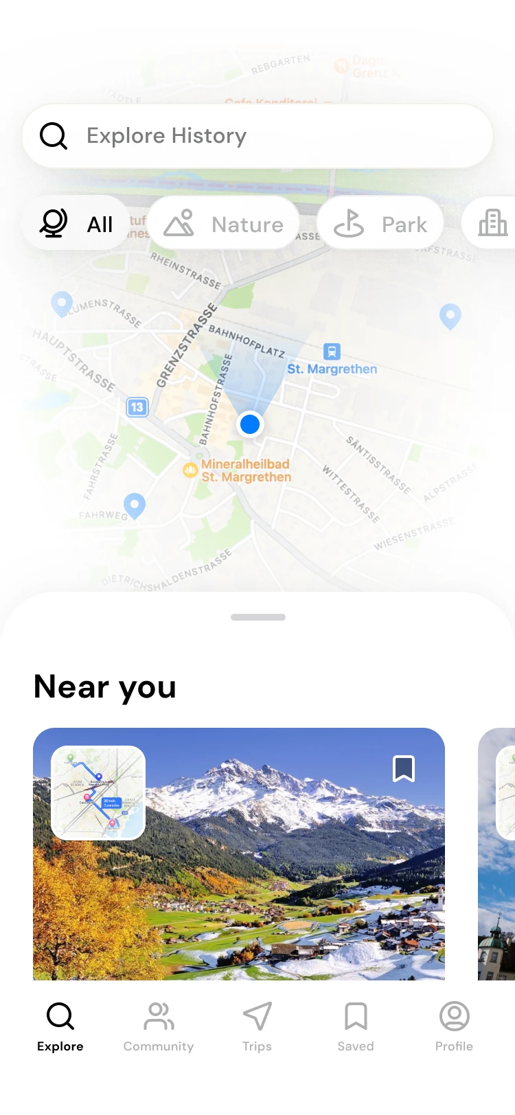
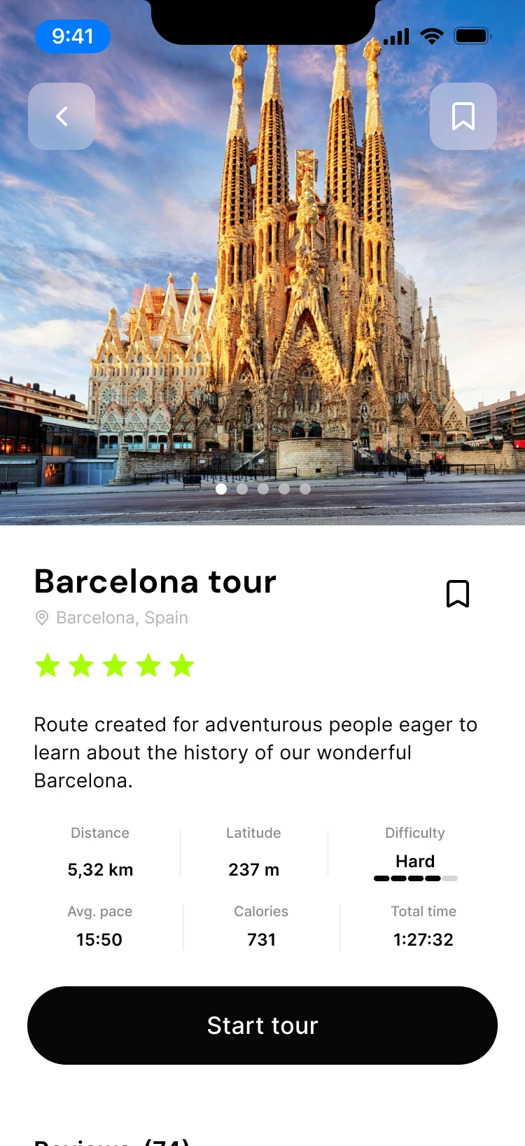
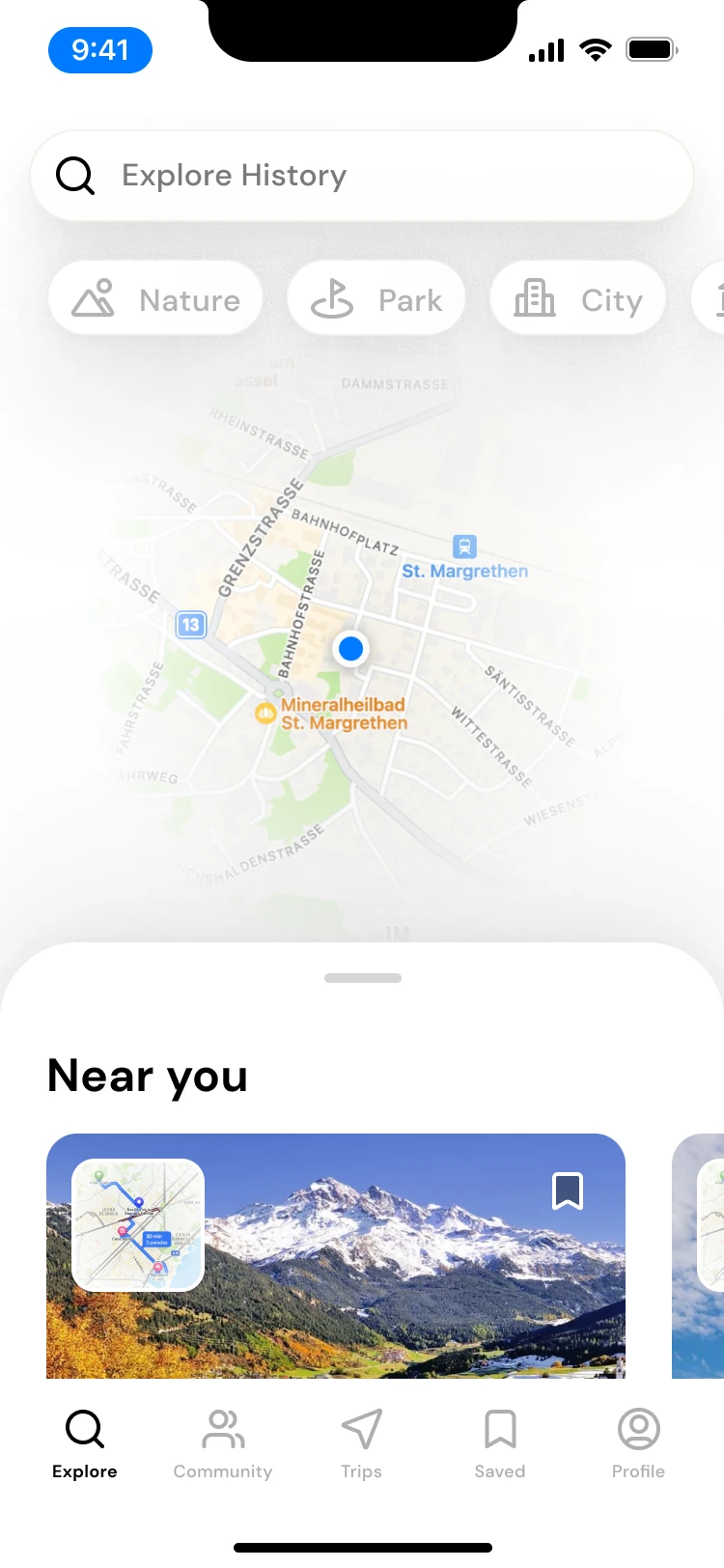
Explore places a map beside nearby routes and category filters. The route detail then brings the destination, distance, difficulty and activity information together above a clear “Start tour” action.

This is the strongest connection with the interview accounts about preparation. Someone needs to judge the outing before starting it, especially when a short route can still be demanding.

The trade-off I would revisit

A destination photograph can make a route appealing, but it does not explain the terrain. I would test whether people can judge effort from the information shown, and whether they understand the difficulty scale. The original screen uses “Latitude” for a value in metres; that label needs clarification before it can support a route decision.

Explore map, categories and nearby routes
01 / Discover nearby routes
Route overview, metrics, difficulty and Start tour
02 / Review the route
06.2 / ON THE ROUTE

Keep the route
and the effort in view.

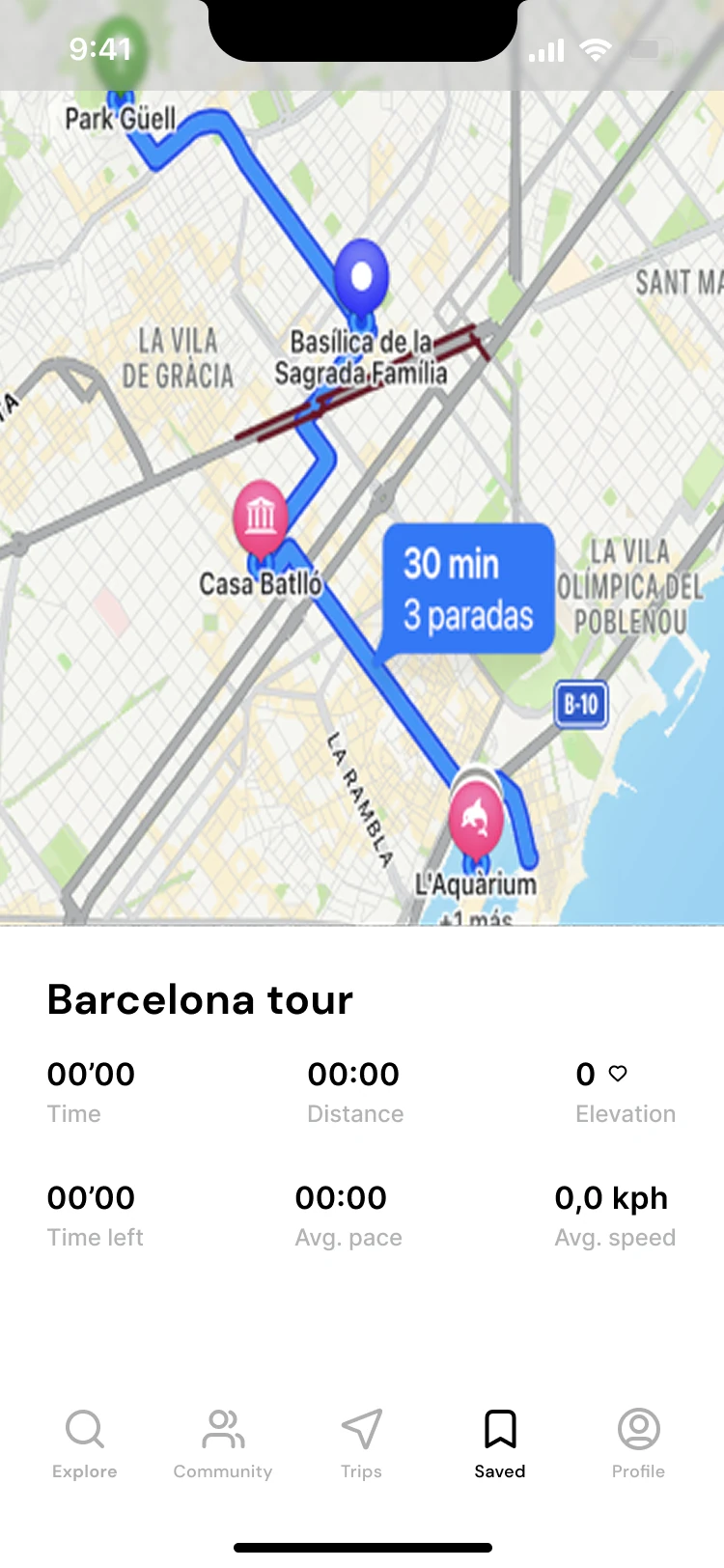
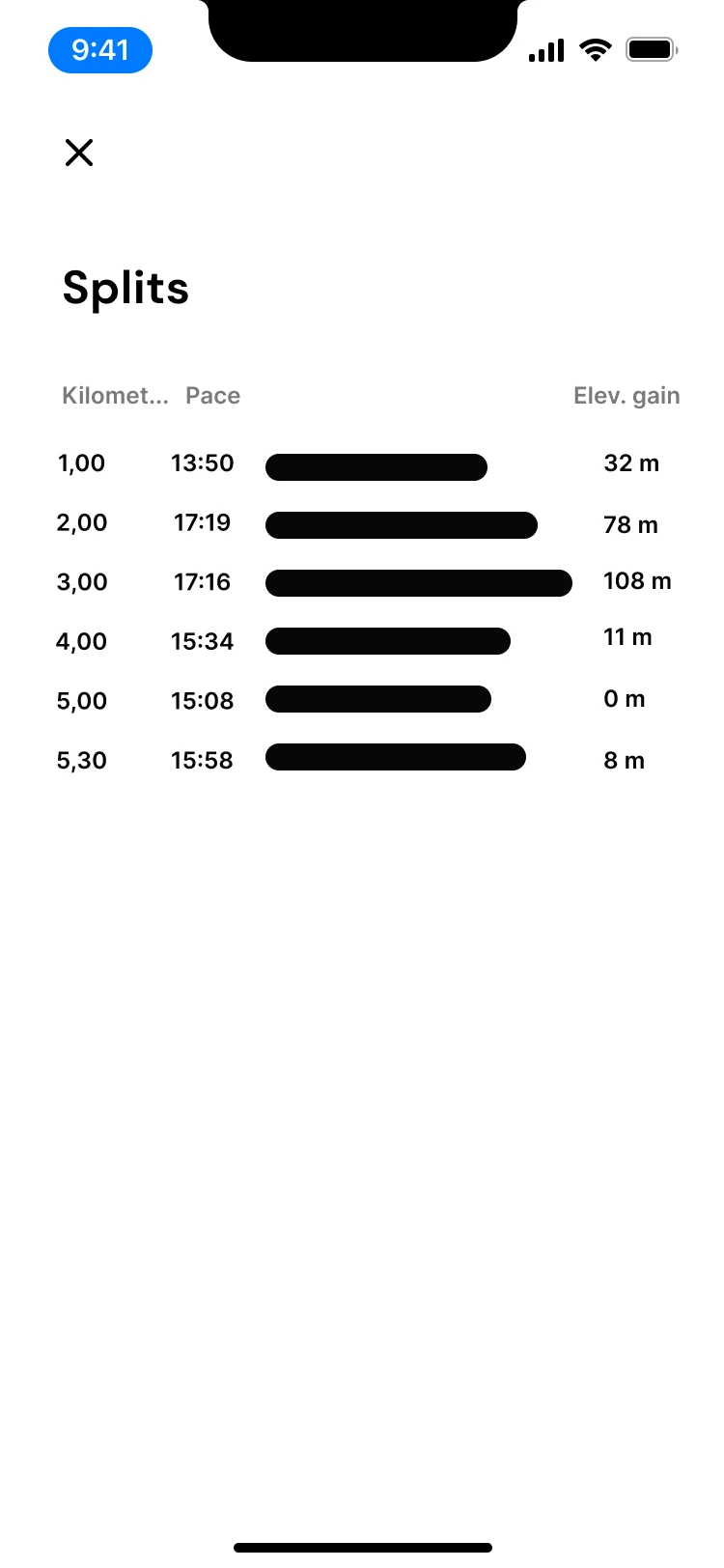
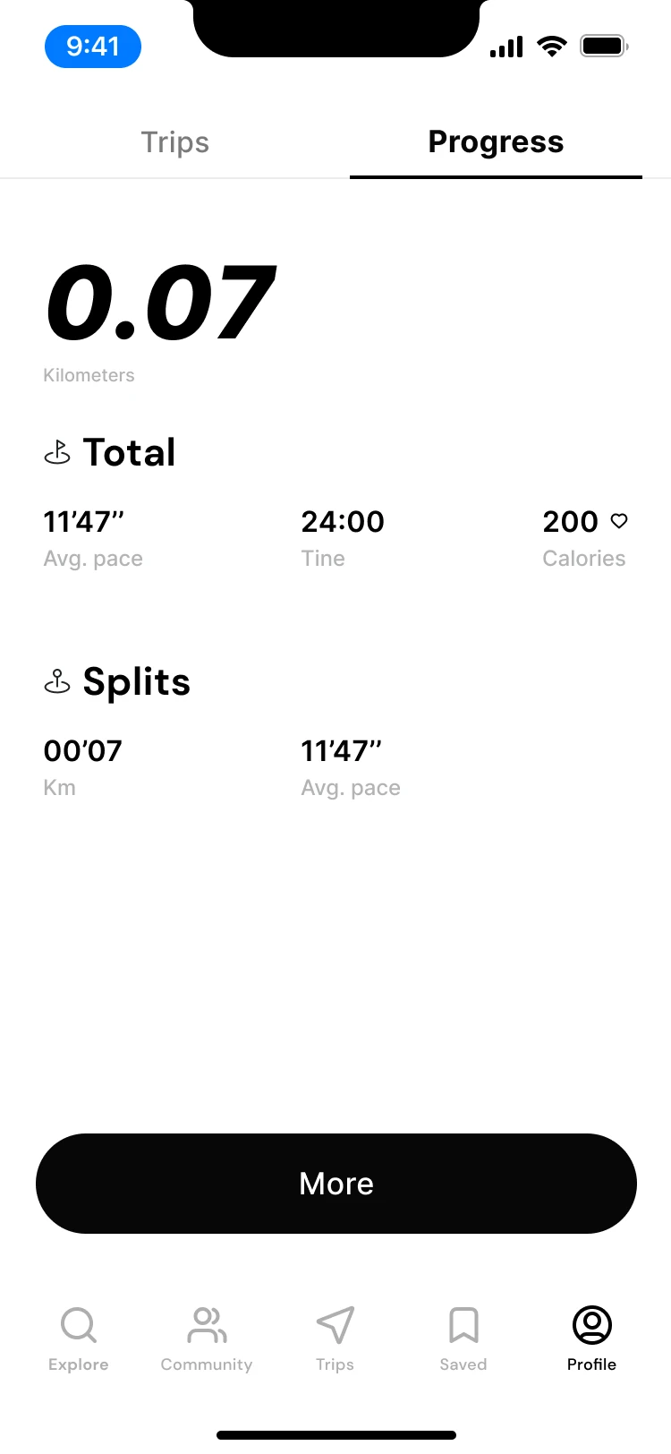
The active-trip screen gives most of its space to the map, followed by time, distance and activity metrics. The separate splits view supports a closer look at pace over the route.

These screens explore two levels of detail: orientation during the activity and a more granular record to inspect. They are design states, not evidence of working GPS, watch integration or emergency support.

What the next iteration needs

The supplied activity screen mixes time, distance and elevation labels with inconsistent values and units. I would define those states with engineering, then test readability while moving and in outdoor light. Start, pause, finish, permission denial and lost-location states need to form a coherent flow before a runner can rely on it.

Active Barcelona route with map and activity metrics
03 / Follow the route
Split times for an activity
04 / Inspect split times
06.3 / SAVE FOR LATER

A good route can
outlast one outing.

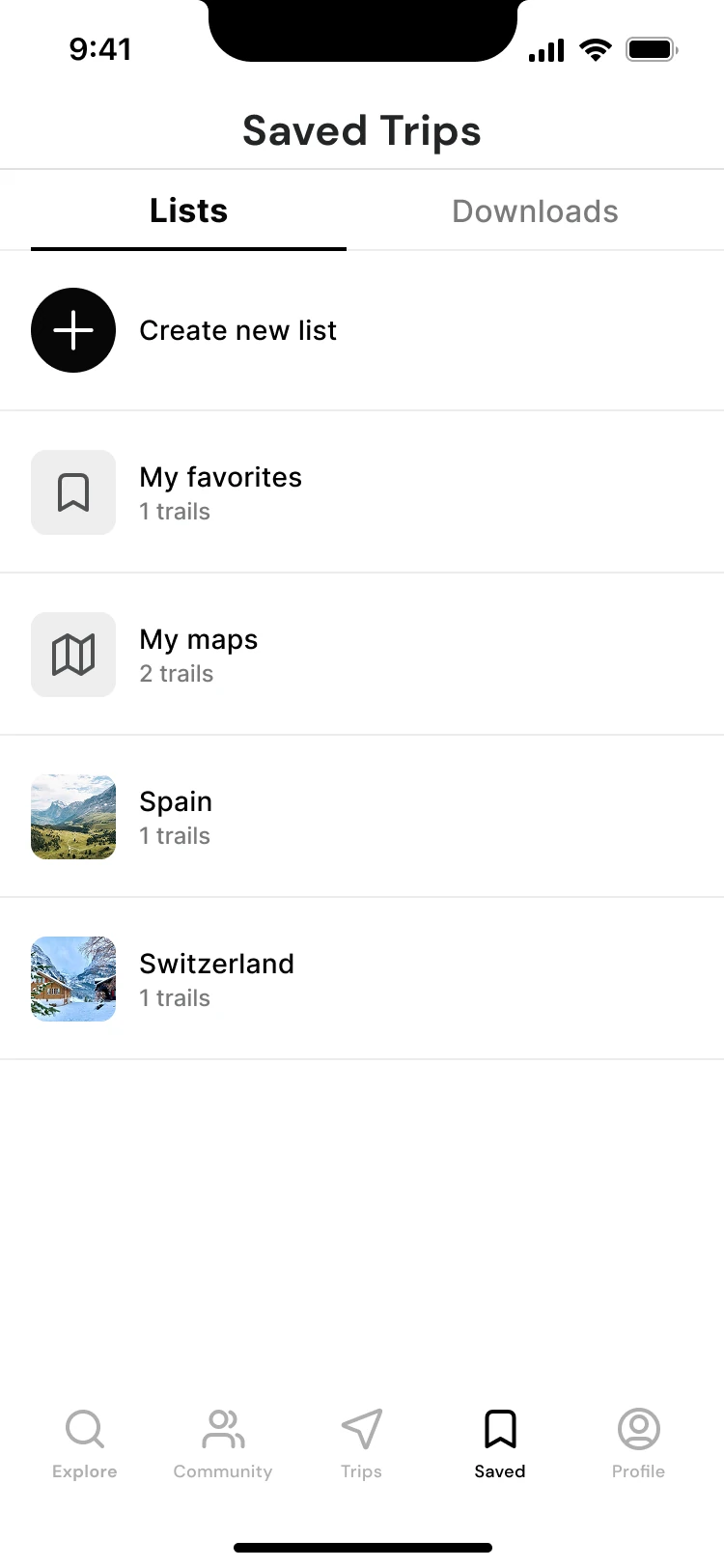
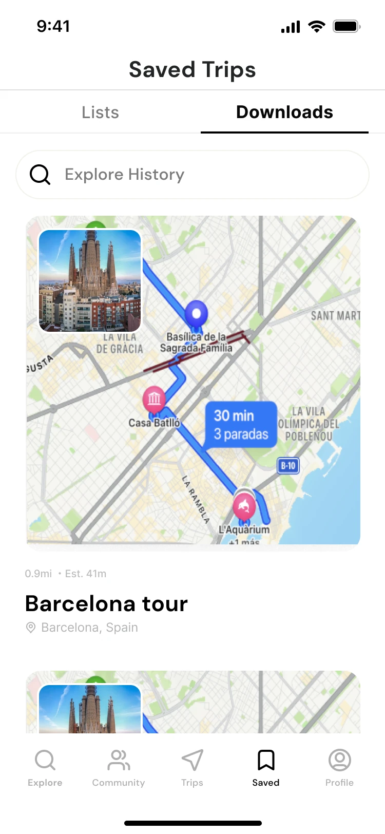
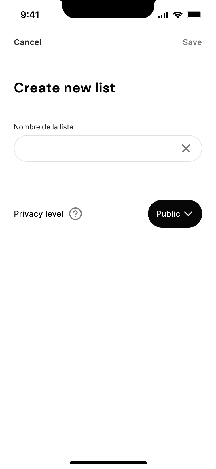
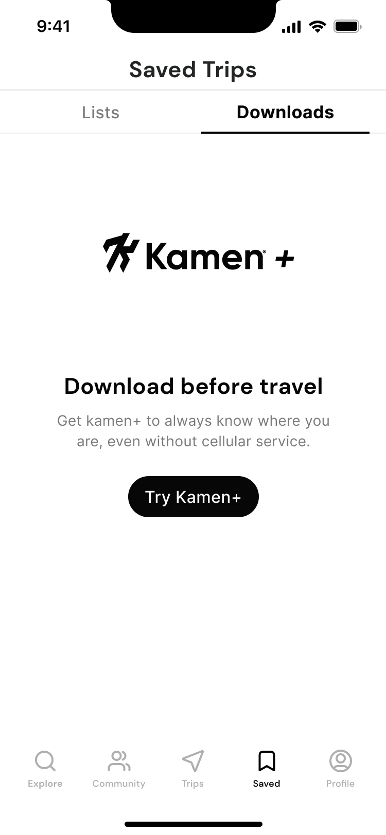
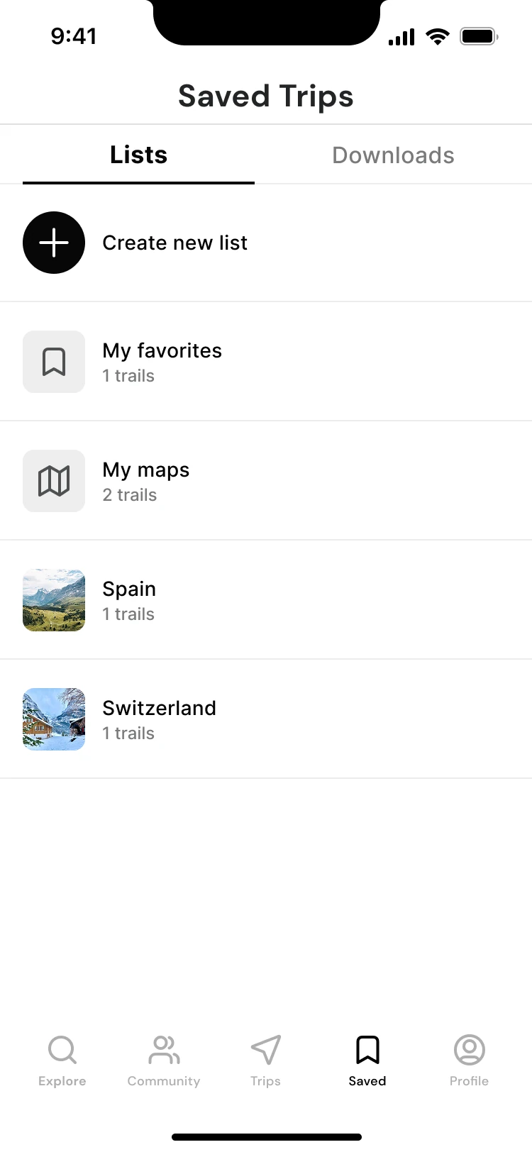
Saved separates lists from downloads. List creation includes a privacy choice, while a dedicated download view keeps routes available to revisit. Another screen introduces Kamen+ as an offline-access proposition.

The separation makes different intentions visible: collecting ideas and preparing to use a route away from a connection. The subscription screen is a concept in the design, not evidence that people would pay for it.

Privacy and offline expectations

The list form defaults to “Public”. I would make that consequence explicit and test whether people notice it. An offline promise also needs a clear download state, storage information and a failure path. Those states are not covered by the retained exports.

Saved route lists with favourites and country collections
05 / Organise routes
Downloaded routes in Saved Trips
06 / Prepare for later
06.4 / PEOPLE & PROGRESS

Leave room for
your own kind of progress.

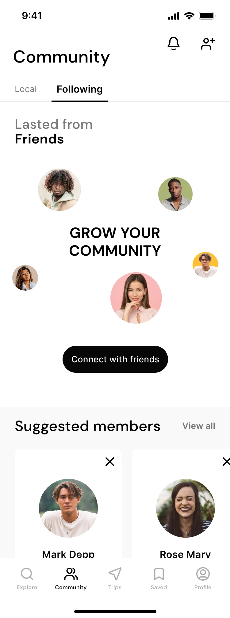
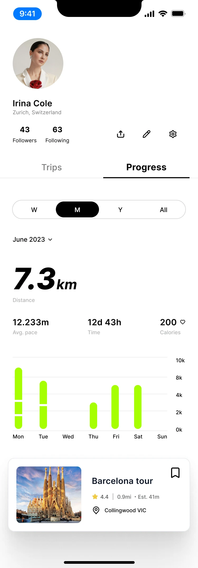
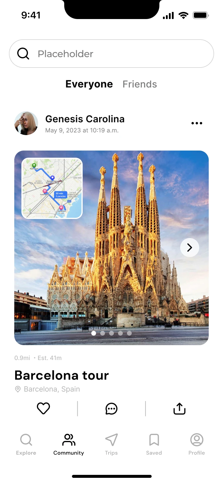
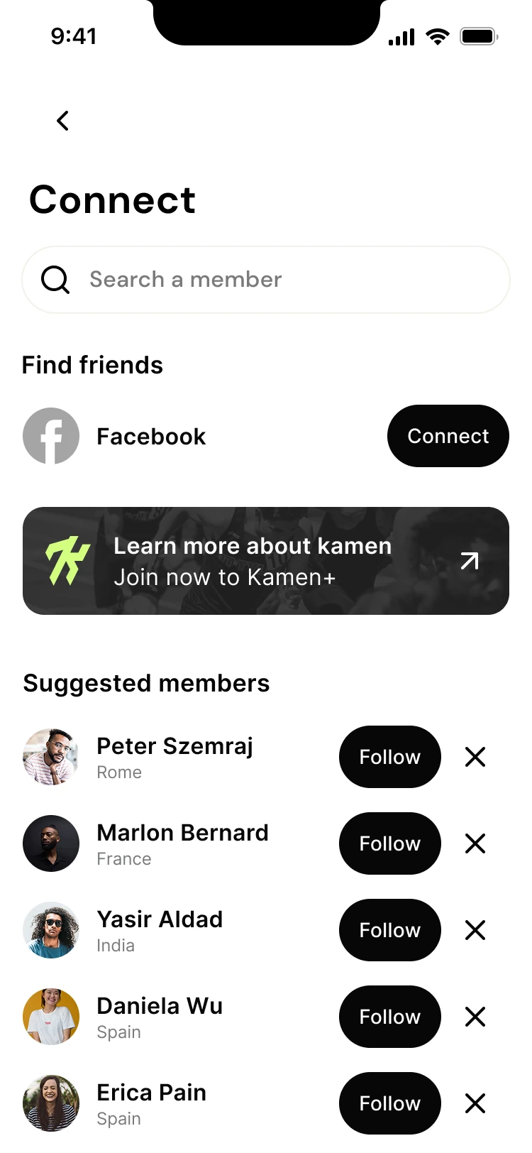
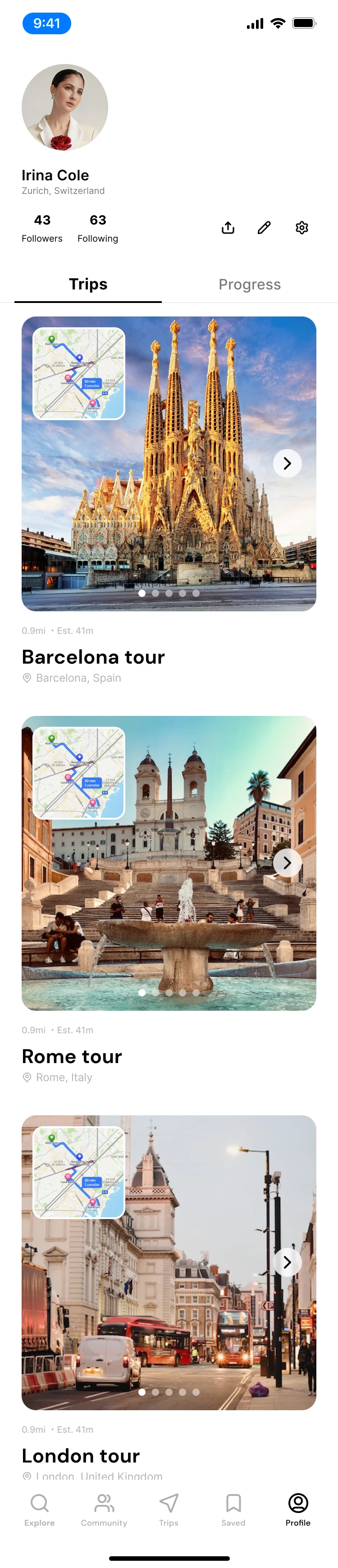
Community introduces people to follow and route posts to explore. Profile brings trips and progress into the same place, with time filters and an activity chart. The design gives both the social experience and the individual record a home.

The interviews contain examples of encouragement from others and gradual increases in distance. Those observations give these directions a reason to exist. They still need separate testing: following someone and understanding your own progress are different tasks.

Using references with judgment

The working folder includes AllTrails reference screenshots alongside Kamen designs. They informed the visual reference set and are not displayed here as original Kamen screens. Several patterns are close to that reference; a stronger next iteration would test which conventions help these users and which need a more specific response to Kamen’s research.

The original screens also retain placeholder copy, mixed units and inconsistent location details. The chart is demonstration content, not a record of a participant’s activity or a measure of product impact.

Community screen with following and suggested members
07 / Find people to follow
Profile with activity history and progress chart
08 / Review personal progress
More of the original screens 09 additional views
Expanded exploration map
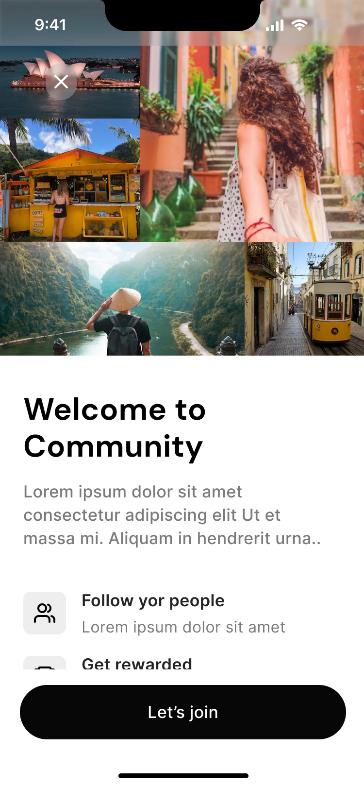
Community welcome
Community welcome
Community route feed
Connect with members
Create a list and choose privacy
Kamen+ offline concept
Profile trip history
Activity summary
Activity summary
Saved lists variant
Saved lists variant
07 / LOOKING BACK

A design direction.
And a clearer next step.

Kamen produced a set of mobile screens spanning discovery, route information, saved trips, community and activity history, supported by research materials and early paper explorations. That is the outcome this archive can demonstrate.

The record does not establish launch performance, retention, conversion or a completed usability study. The next step would be to observe whether the core journey works, then use those findings to revise the design.

What I would carry forward

The most useful research details were specific: an unexpectedly difficult climb, a friend who encouraged a longer run, the pleasure of staying after a race. Each gives a design discussion more direction than an abstract claim that people need motivation.

What I would do differently

I would start with a narrower question about choosing a suitable route. I would keep participant evidence, interpretation and design decisions connected throughout the work, rather than reconstructing those links later. The strongest next version would also resolve terminology and content before adding more features.

The next research round I would run

Proposed validation plan. These activities and measures are not completed results.

Choose a suitable outing

Give someone a time limit, a preferred area and their own activity constraints. Ask them to choose a route and explain the choice.

Observe: information used, misunderstood labels, unsupported assumptions and completion without help.

Prepare for a weak connection

Ask them to keep the chosen route for an outing where they may lose connectivity.

Observe: distinction between saving and downloading, readiness feedback and expectations about offline use.

Read personal progress

Ask them to find a past activity and explain what the progress view says about it.

Observe: units, chart interpretation, navigation between summary and detail, and confidence in the answer.

Control what others can see

Ask them to create a collection for personal use and then find someone to follow.

Observe: awareness of visibility settings, accidental sharing and expectations about the community feed.

I would recruit people whose activity habits and digital confidence fit the research question, include relevant access needs, and record task completion, errors, requests for help and participants’ explanations. A further round with revised screens would let us compare behaviour. NN/g’s usability-testing guidance describes this task-based approach.

The next version starts with a simple test: can someone tell whether this route is right for them?

Sources & how this case was reconstructed

The case uses the supplied topic list and interview results, the four-page interview guide, the participant-note board, the two proto-personas, the original Kano form, two paper-wireframe scans and the Kamen screen exports. Participants are referred to as P01, P02 and P03; the interview notes are paraphrased rather than presented as verbatim transcripts.

The narrative order is editorial. It does not establish the exact chronology of the original work. Theme grouping, the revised questions, the interface critique and the proposed validation plan are retrospective contributions. Unavailable results have not been reconstructed.

The page follows relevant guidance on showing context, contribution, process and evidence. It does not claim NN/g certification or universal compliance.